Heartify — Health Dashboard Redesign
From concept to animated UI: a medical-grade dashboard that makes health data feel personal.
Overview
Heartify is a health monitoring app focused on heart health, stress, sleep, and activity. The goal was a complete dashboard redesign — moving away from a generic interface toward a high-tech, medical aesthetic that makes users feel like they're looking at themselves, not just numbers. I owned the project end-to-end: concept, UX logic, visual design, 3D character creation, animation, and technical specs for developers — including all metric formulas and interaction logic.
The Problem
The existing dashboard felt flat and disconnected. Users couldn't intuitively understand their health state at a glance. The data was there — but it didn't feel meaningful or personal.
The Goal
Design a dashboard where users see a representation of their own body with real-time health metrics layered on top — energy, stress, heart rate, activity, and sleep — all pulled from wearable devices (Apple Watch, Garmin, and other variable devices).
Key Design Decisions
Process
Result
The redesign reached 95% production-ready within 2 months — complete with UI specs, animation assets, metric formulas, and full developer documentation. The release was paused due to a shift in company priorities, not design quality. The project remains one of my most complete end-to-end works: from blank canvas to a fully specced, handoff-ready product.

The dashboard unifies multiple health signals into one clear daily view. By bringing together energy, stress, heart rate, sleep, and activity, it helps users understand their current state and make better decisions about rest, movement, and recovery.

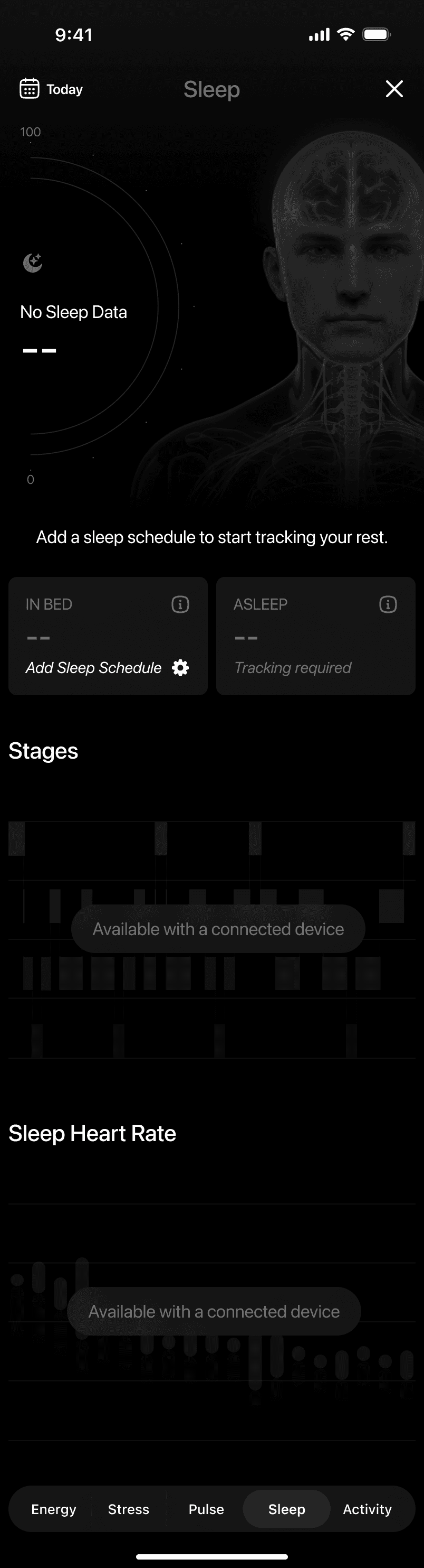
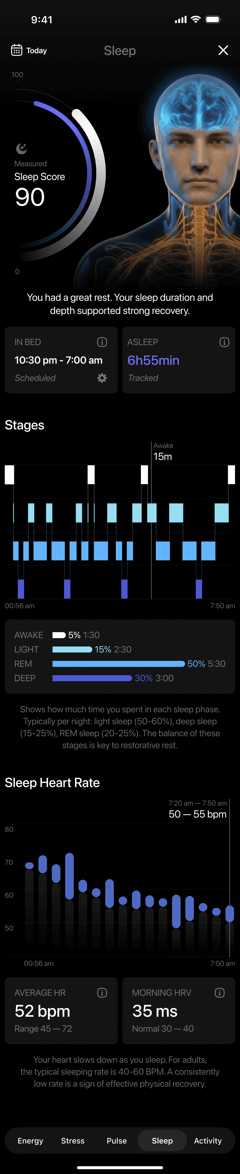
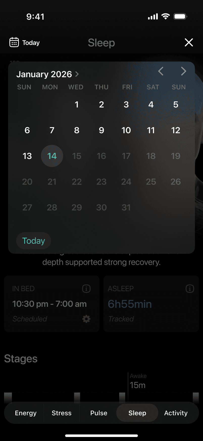
Sleep & Recovery
The sleep feature focuses on recovery quality rather than just duration. It combines sleep score, time asleep, and sleep stages into a single view, helping users understand how well their body recovered overnight and how that impacts the day ahead.

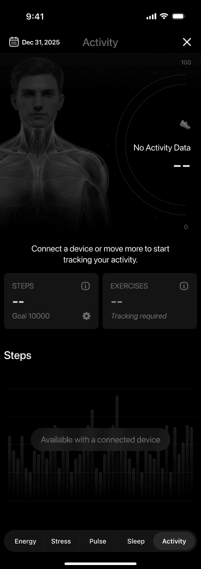
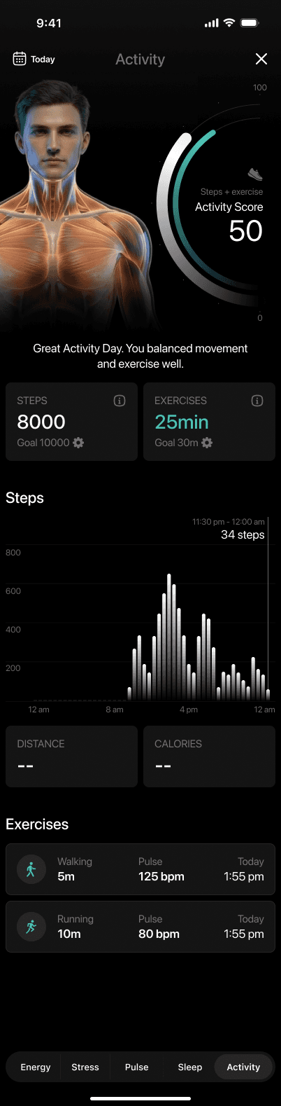
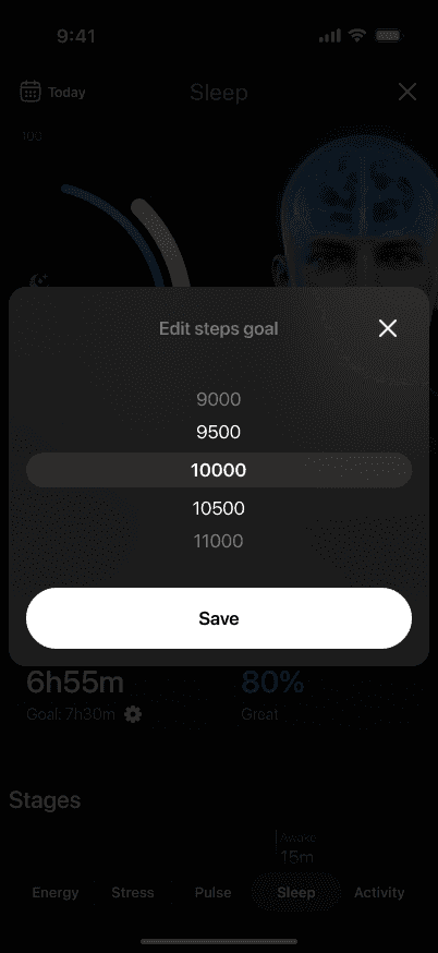
Activity & Daily Movement
The activity feature highlights how movement and exercise contribute to overall health. It combines steps and workouts into a single score, helping users understand whether their daily activity supports balance and recovery rather than just hitting numbers.

Energy & Stress Balance
Energy and stress are presented as two sides of the same system. The feature shows how sleep, activity, and daily demands charge or drain energy over time, while stress highlights how the nervous system responds to those demands. Together, they help users recognize patterns between load, recovery, and resilience.


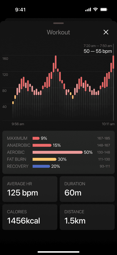
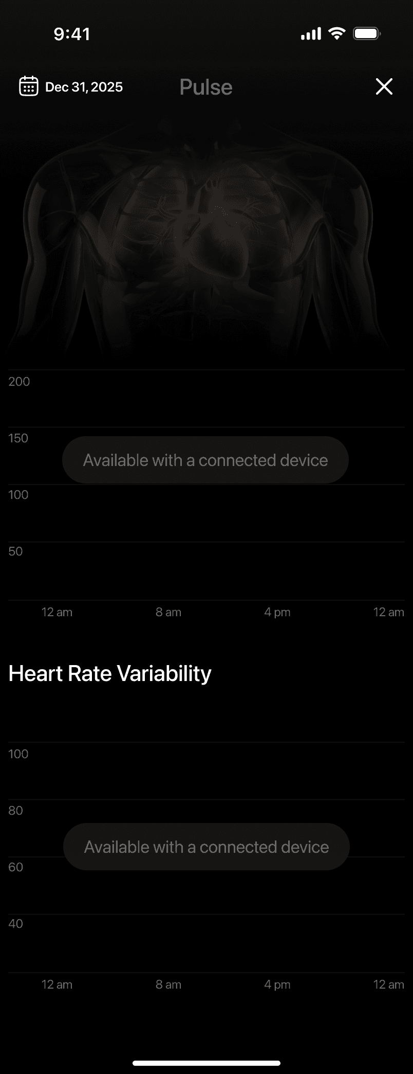
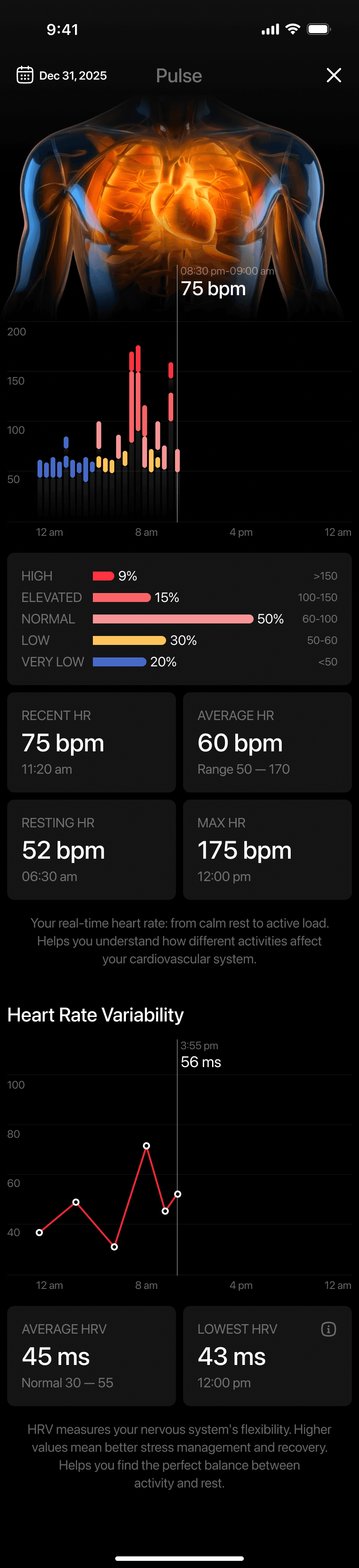
Pulse & Heart Signals
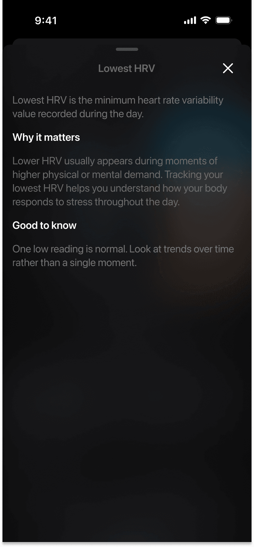
The pulse feature provides insight into how the heart responds throughout the day. By visualizing heart rate and variability over time, it helps users understand moments of rest, activity, and increased strain without requiring medical interpretation.
Process
Rejected direction — early concept

One of several visual directions explored before committing to the final concept. Rejected due to low information density and weak hierarchy.
Beyond Design — Technical specification

Most of my work on Heartify went beyond visual design. I developed the scoring logic for each health metric — defining formulas, edge cases, data availability rules, and output contracts. These specs were handed directly to developers as the source of truth.
3D character creation process

The anatomical character was modeled, rigged, and animated from scratch. Each health state — rest, stress, elevated heart rate — has a unique animation loop tied to real-time data.