Heartics — Pulse & HRV Analyzer
Designing a camera-based heart rate monitor with AI-powered analysis and medical-grade data visualization.
Overview
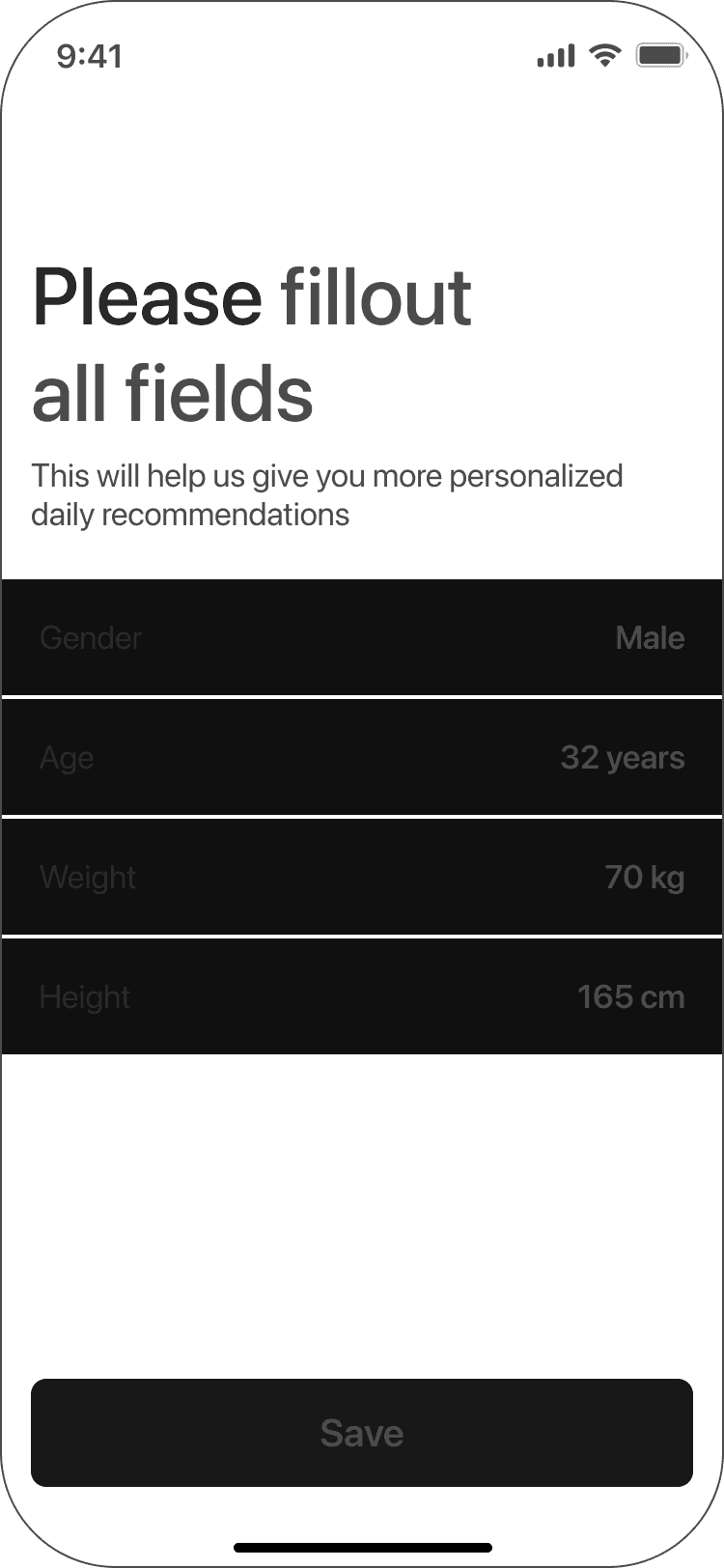
Heartics is a health app that measures pulse through the phone camera and visualizes heart rate variability using a Poincaré plot — a medical diagnostic tool typically found only in clinical software. The app includes an AI assistant that analyzes results and explains what the data means for the user's cardiovascular health. I built the product from scratch — concept, UX flow, visual design, and developer handoff.
The Problem
HRV analysis is a powerful health metric but it's locked behind medical devices and complex clinical interfaces. Consumer apps either oversimplify the data or present it in ways that feel meaningless. There was no product that combined accurate camera-based measurement with a visualization that users could actually understand and trust.
The Goal
Build an app that measures pulse through the camera, renders HRV data as a Poincaré plot in real time, and uses an AI assistant to translate the results into plain, actionable health insights.
Process
Result
A fully designed, handoff-ready iOS app completed in 1 month. The project reached production-ready stage but launch was paused due to a shift in company priorities, not design quality.


Measuring
The app uses your phone's camera to measure heart rate through subtle changes in blood flow — photoplethysmography. Users see a live Poincaré plot, a real-time heart rate graph, and gentle on-screen guidance.


Result
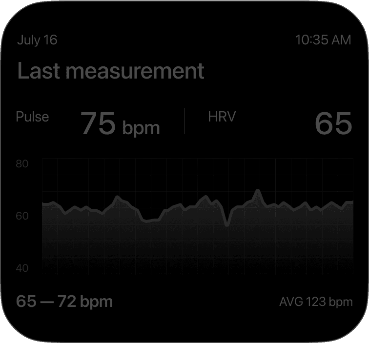
After the measurement, users see their heart rate and HRV results alongside insights from the AI Health Assistant. The assistant highlights changes, trends, and provides an easy-to-understand overview of heart health.

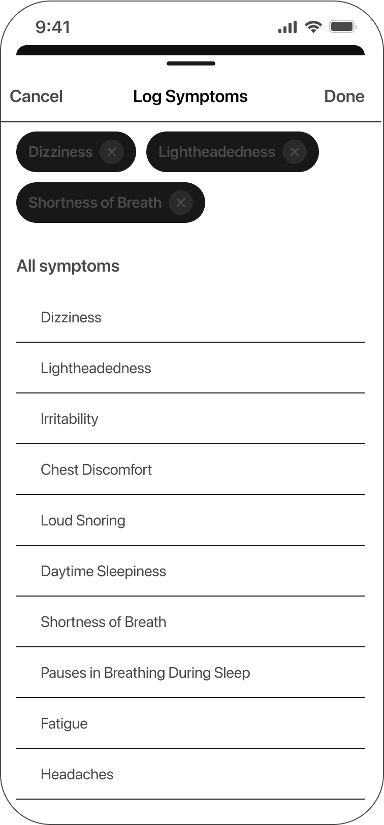
Users can log their symptoms to add extra context to each measurement, helping the app provide more accurate insights and a deeper understanding of their overall condition.

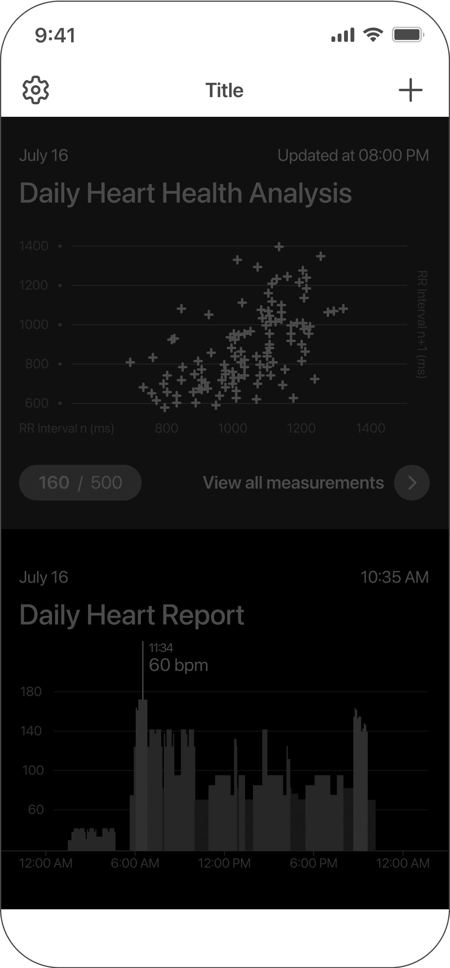
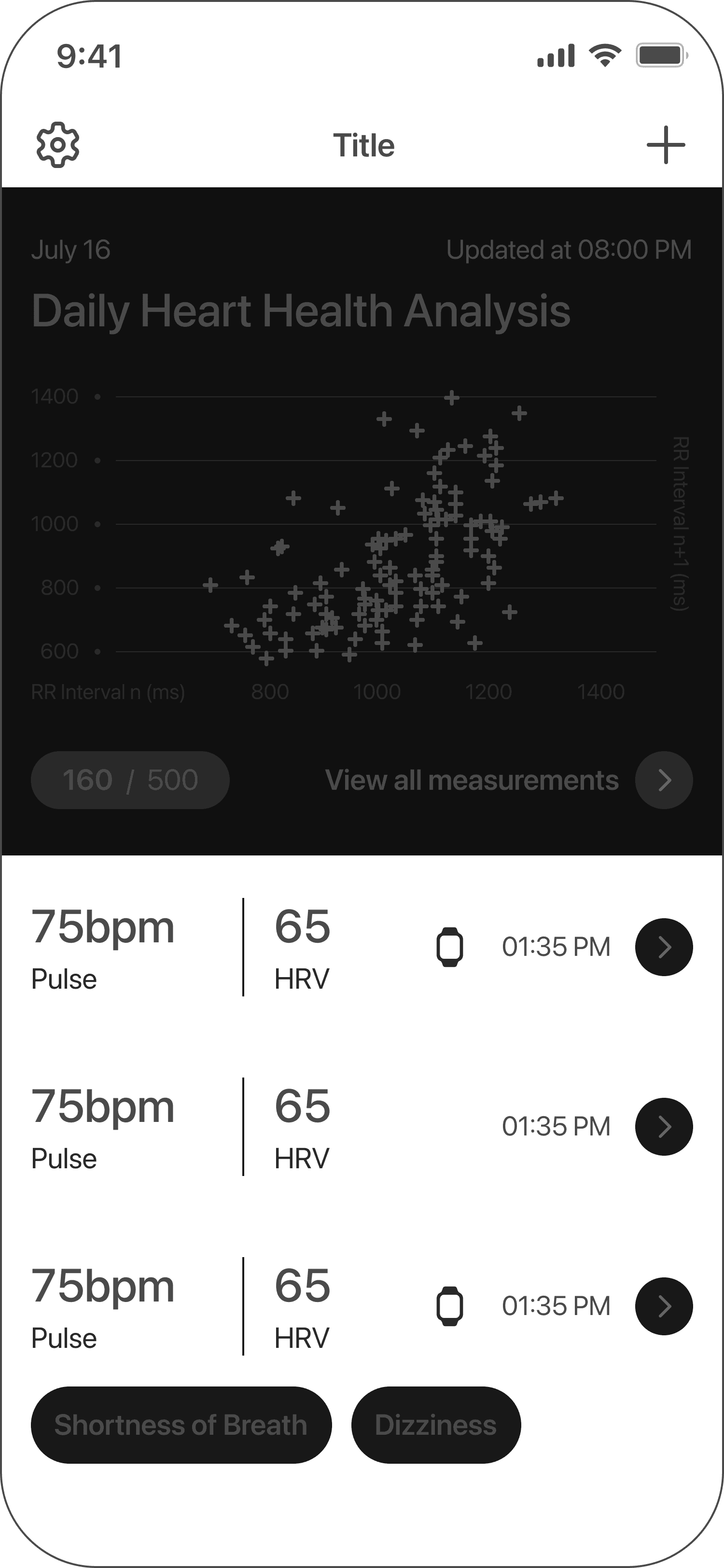

Dashboard
The dashboard gives users a clear overview of their heart health history, recent measurements, and trends — making it easy to track changes over time and understand their overall condition at a glance.


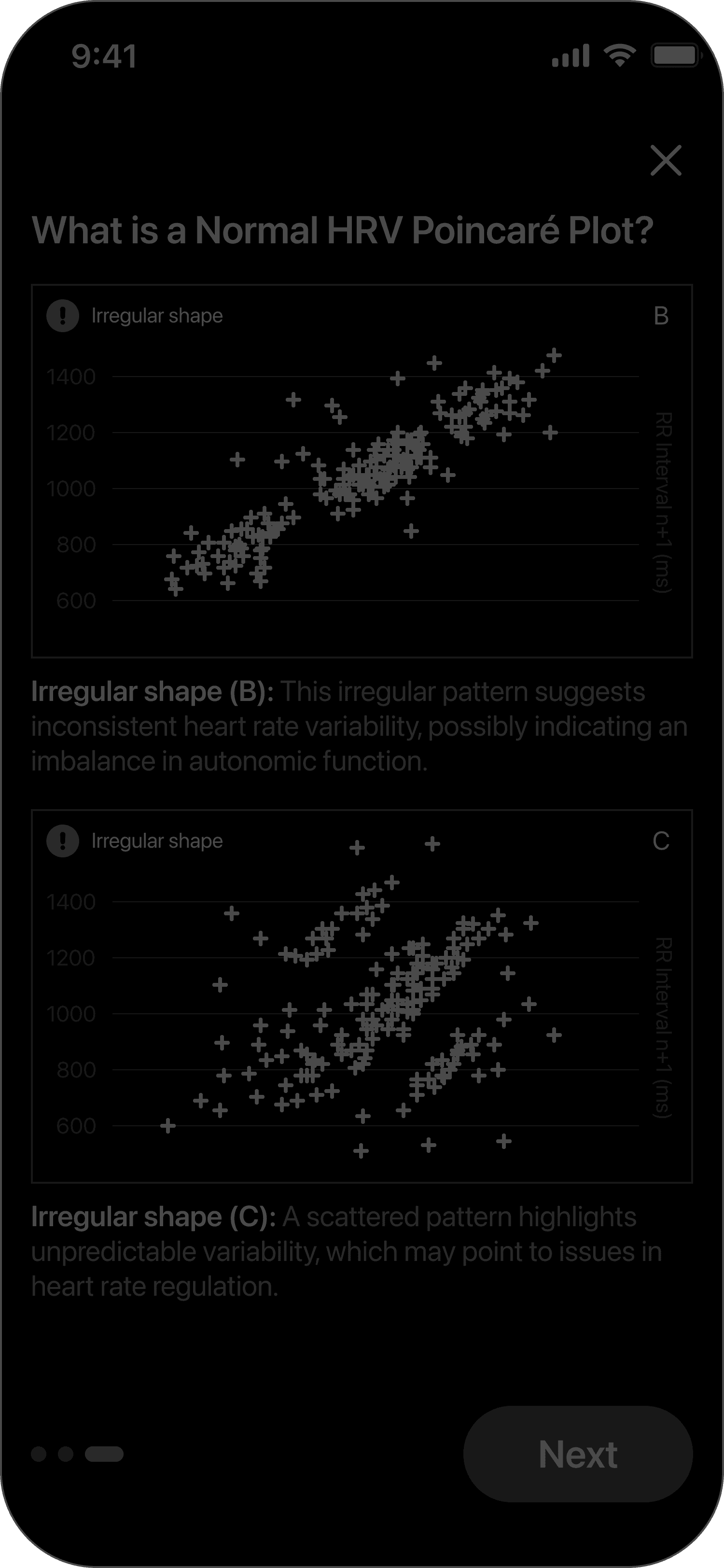
Reading the Pattern of Your Heart
Explore how your Poincaré plot visualizes the natural rhythm of your heart. By learning what smooth or scattered shapes mean, you can better track your heart's variability and daily wellbeing.


Process
Project management — Jira board

All tasks, user stories, and sprints were tracked in Jira — from initial research through design handoff. Each screen had its own ticket with acceptance criteria and linked Figma frames.
Design process — dashboard, result screen & graph variations

Here I show the process of creating the dashboard and result screen — including layout iterations, data hierarchy decisions, and multiple variations of the heart report graphs. Each variation was tested for readability and visual clarity before the final direction was chosen.