Heartify — Health Dashboard Redesign
From concept to animated UI: a medical-grade dashboard that makes health data feel personal.
I owned product design at Heartify for 5 years — a consumer heart-health app that grew to 100K+ downloads, 4.8★ across 114K+ reviews, and ~$500K monthly revenue at peak. This case study is the Heartify 3.0 redesign: a proposed dashboard update, fully designed but not shipped, so the numbers below are what it was built to move — not results.
Heartify measured plenty — heart rate, stress, energy, sleep — but each reading lived on its own. Users couldn't see how activity, sleep, stress, and HR connect, or how they shape health day to day. The app showed numbers, not meaning — sharpest for wearable users with rich data but no full picture.
Design a daily health dashboard that turns raw numbers into understanding — scores, graphs, and trends showing where a user is strong and where to pay attention. Two metrics drove the design:
Engagement and retention
A dashboard worth opening dailyConnecting metrics into one picture gives a reason to return — instead of dipping in only after a workout.
Subscription conversion
Value first, then pay for depthKeep the basic scores free; lock the detailed score screens and full-history calendar behind the paywall. Users see the value before they pay.
3D anatomical character
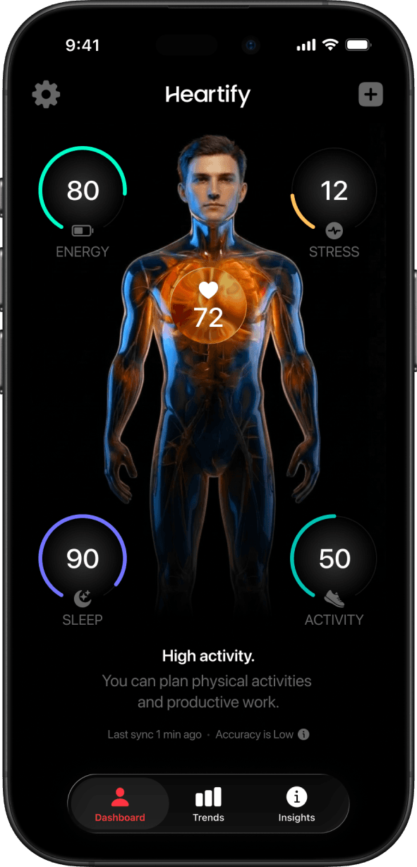
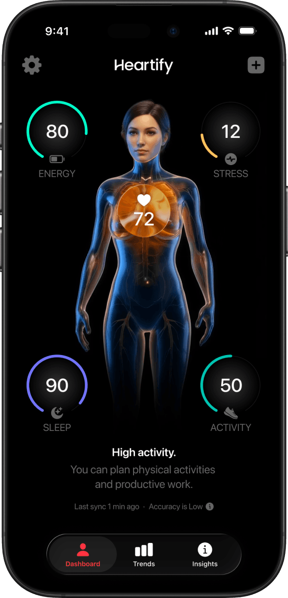
Instead of abstract charts, users see a human figure that reflects their body state. This grounds the data in something visceral and immediately understandable.
Dark, medical aesthetic
A dark theme with precise data visualization creates a high-tech, clinical feel — serious enough to be trusted, modern enough to feel premium.
Formula-driven metrics
Every metric (energy score, stress index, recovery level) was calculated using custom formulas I developed and documented for the engineering team.
Animation as communication
The interface is fully animated. Motion is not decorative — it signals state changes, alerts, and data updates in real time.
- 01Explored multiple visual directions before committing to the final concept.
- 02Developed the metric formulas and wrote technical specifications for developers.
- 03Created the 3D characters and all animation assets from scratch.
- 04Iterated on layouts to balance information density with clarity.
Designed but not shipped — so no claimed results. What the work was built to move and how I'd prove it:
Retention
D30 lift +5ppDaily return rate and 30-day retention, 3.0 vs. old.
Subscription
Trial-to-paid conversionA/B test where the free/paid line sits — detailed scores and history calendar as candidates.
The Dashboard
The dashboard unifies multiple health signals into one clear daily view. By bringing together energy, stress, heart rate, sleep, and activity, it helps users understand their current state and make better decisions about rest, movement, and recovery.
Sleep & Recovery
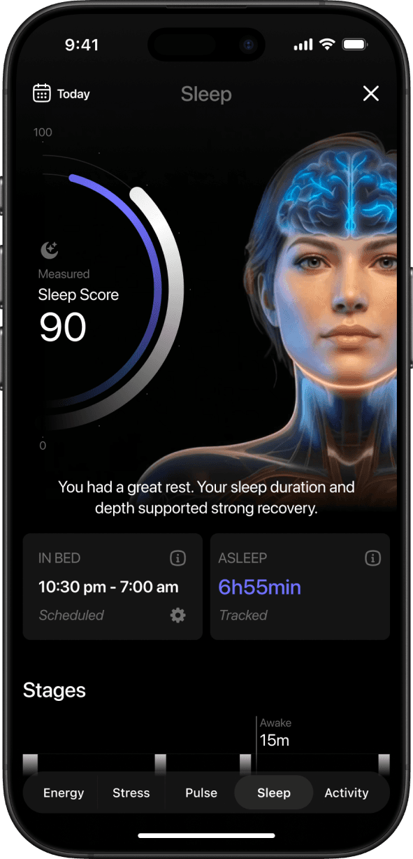
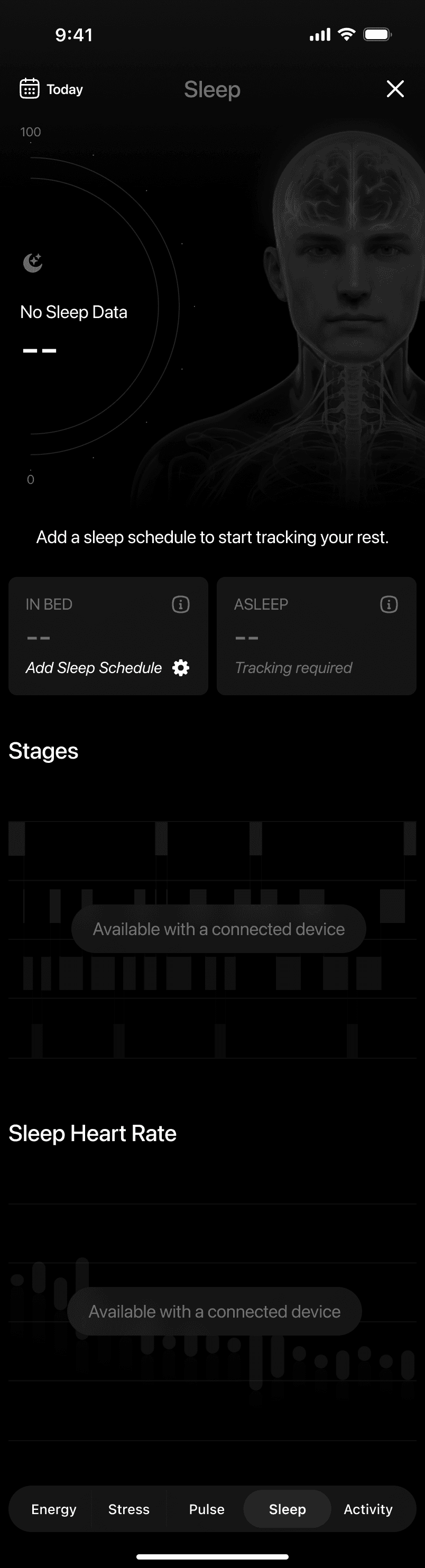
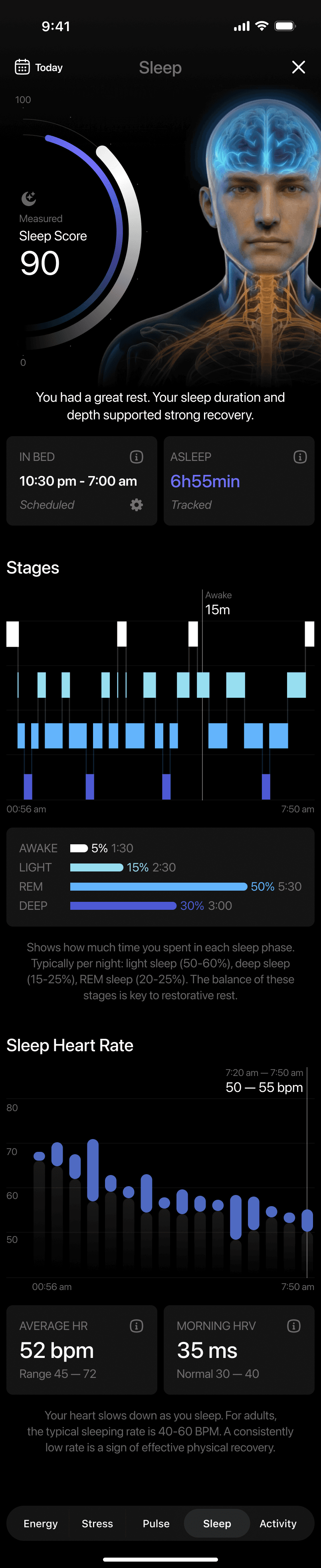
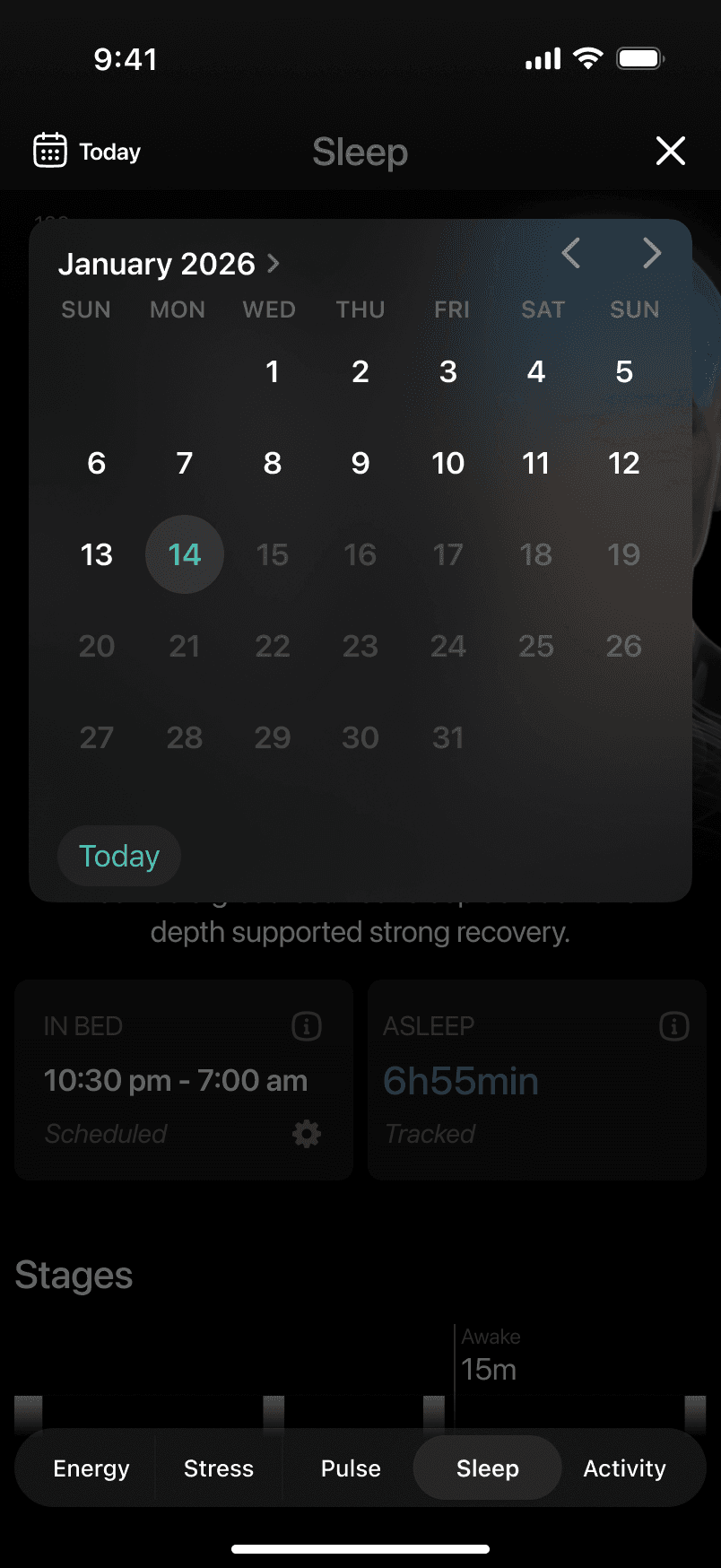
The sleep feature focuses on recovery quality rather than just duration. It combines sleep score, time asleep, and sleep stages into a single view, helping users understand how well their body recovered overnight and how that impacts the day ahead.
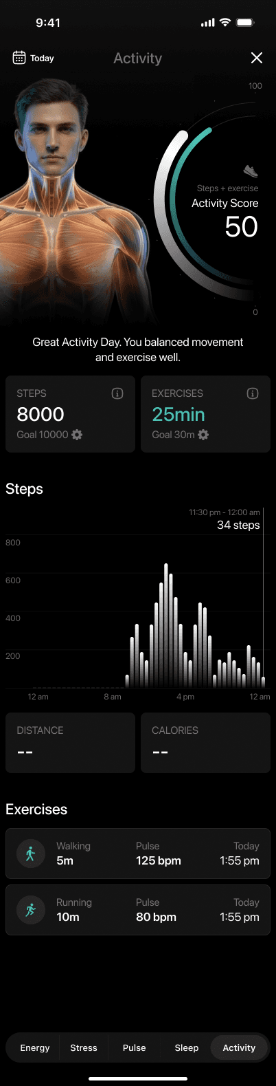
Activity & Daily Movement
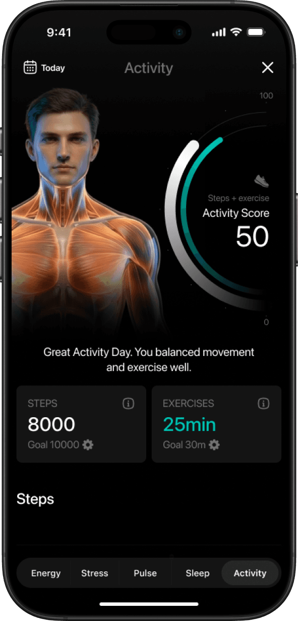
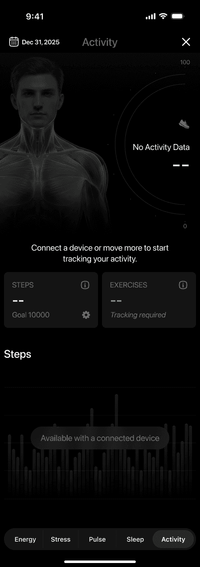
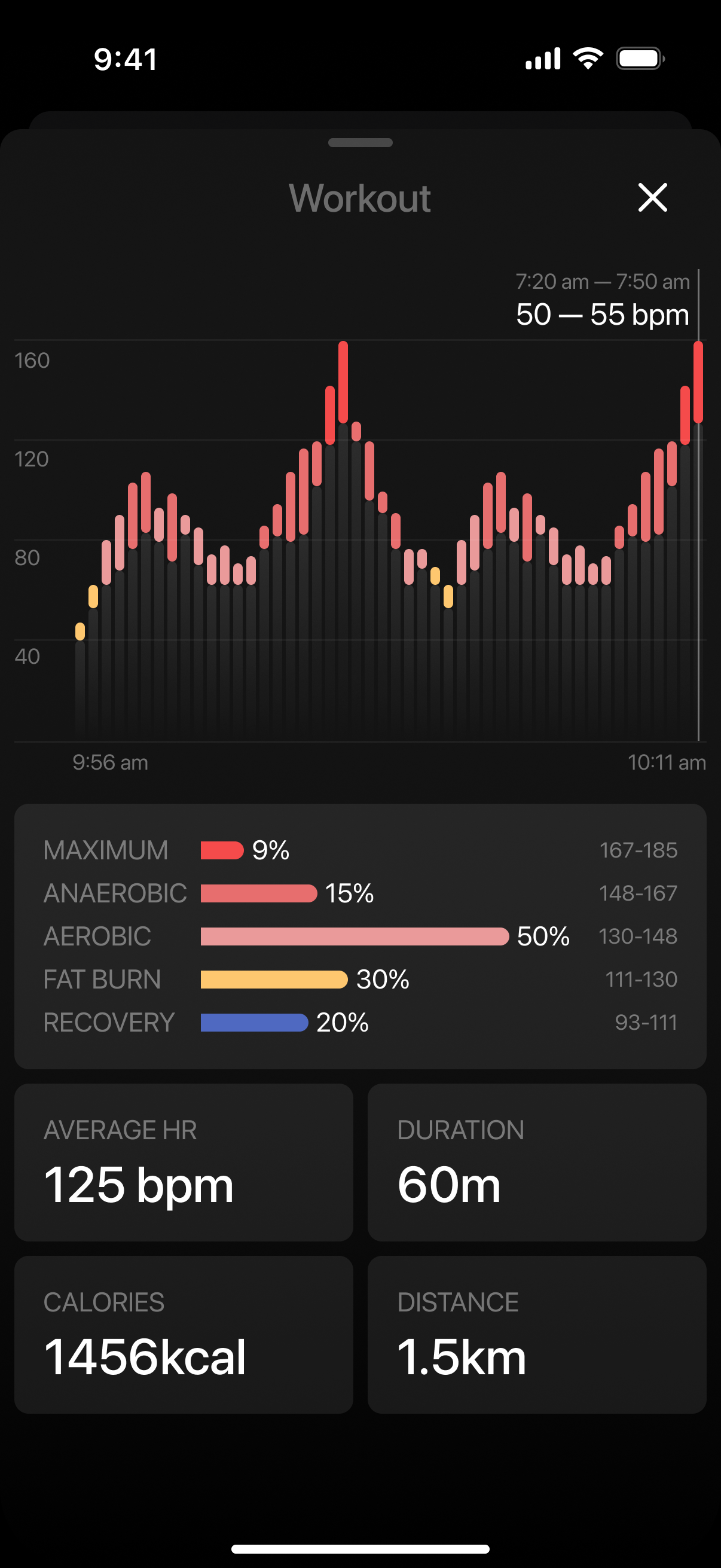
The activity feature highlights how movement and exercise contribute to overall health. It combines steps and workouts into a single score, helping users understand whether their daily activity supports balance and recovery rather than just hitting numbers.
Energy & Stress Balance
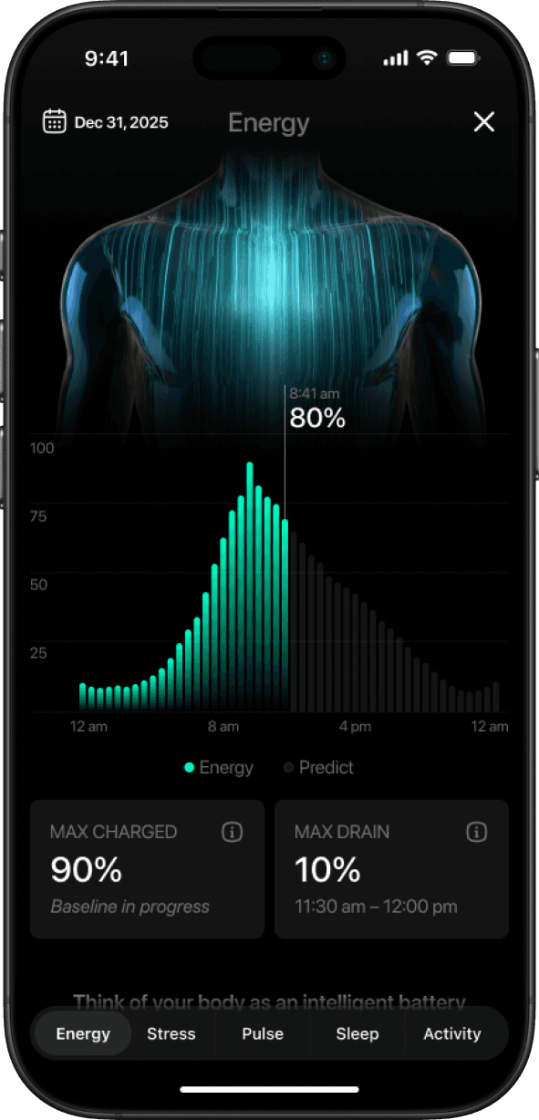
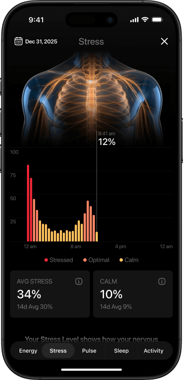
Energy and stress are presented as two sides of the same system. The feature shows how sleep, activity, and daily demands charge or drain energy over time, while stress highlights how the nervous system responds to those demands. Together, they help users recognize patterns between load, recovery, and resilience.
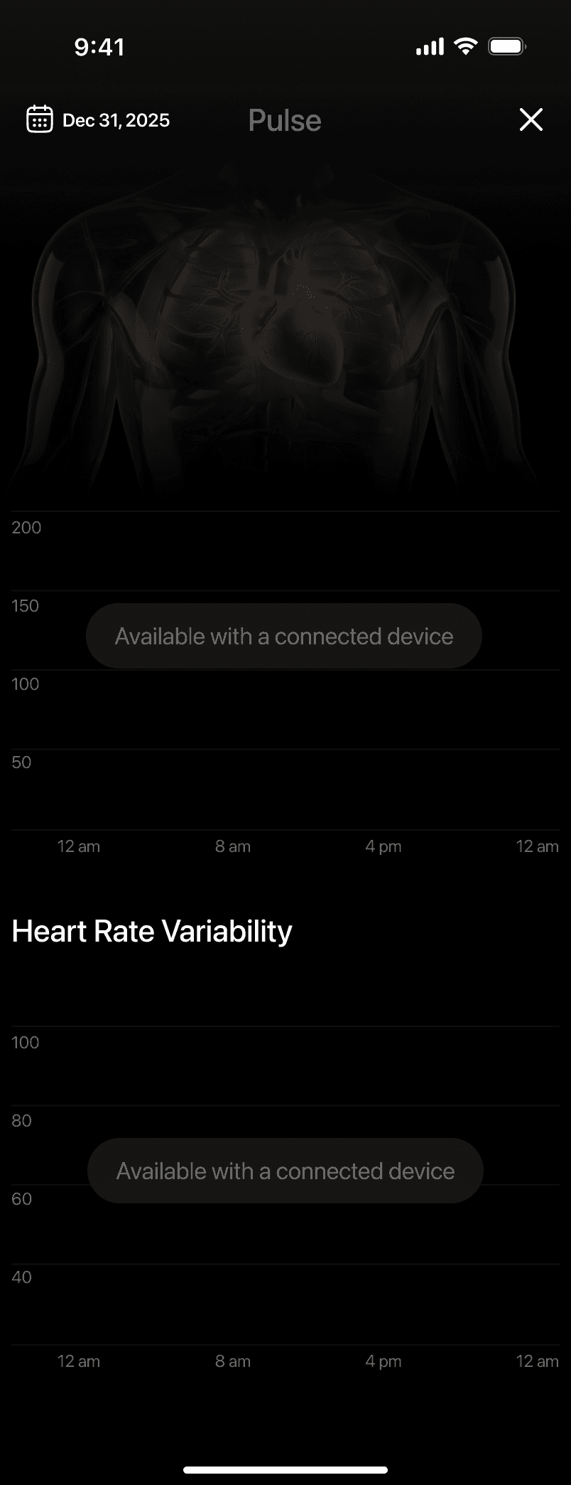
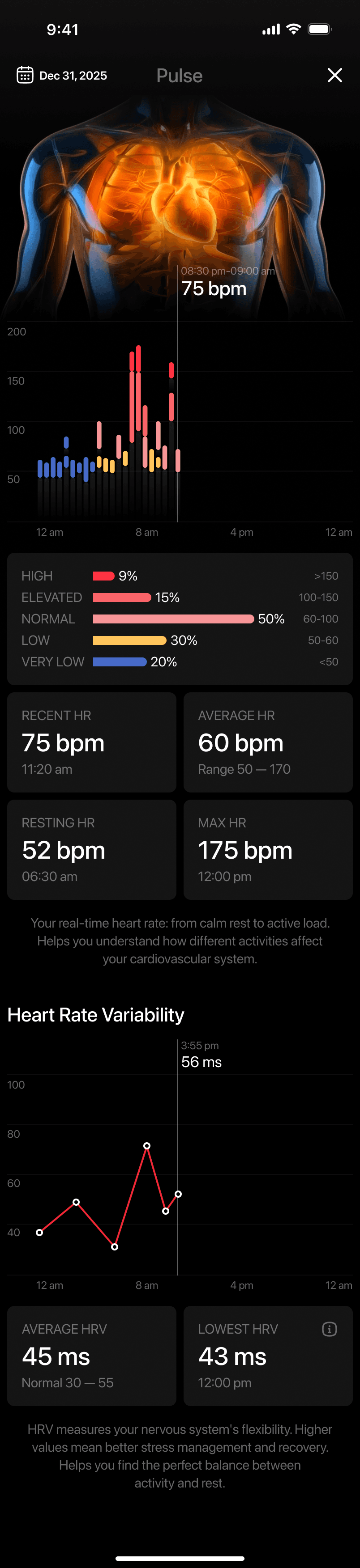
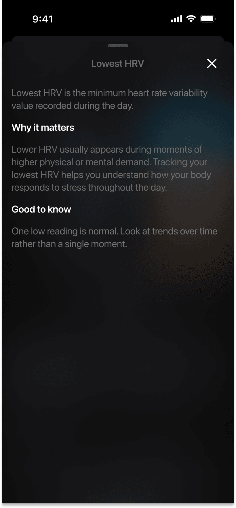
Pulse & Heart Signals
The pulse feature provides insight into how the heart responds throughout the day. By visualizing heart rate and variability over time, it helps users understand moments of rest, activity, and increased strain without requiring medical interpretation.
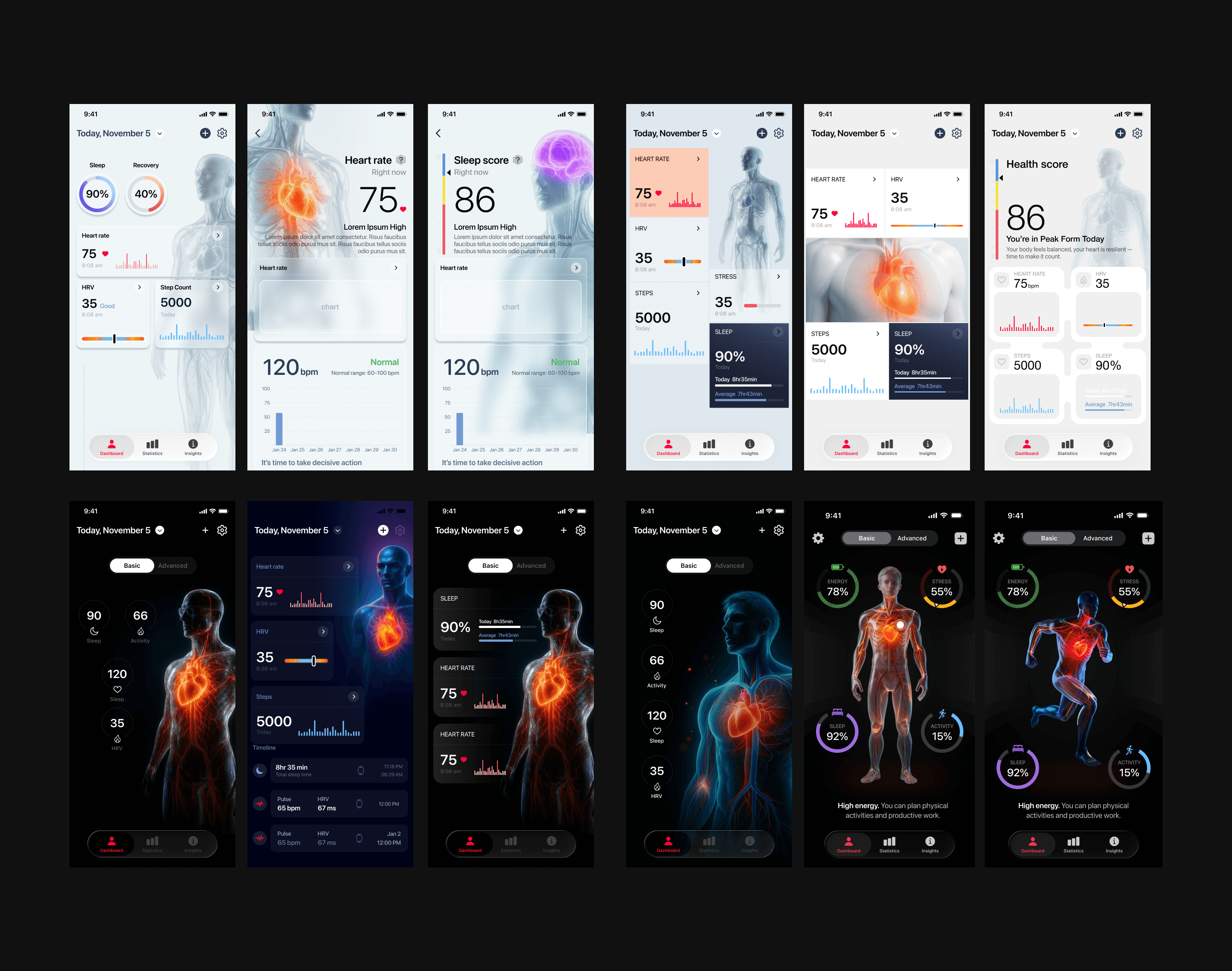
One of several visual directions explored before committing to the final concept. Rejected due to low information density and weak hierarchy.
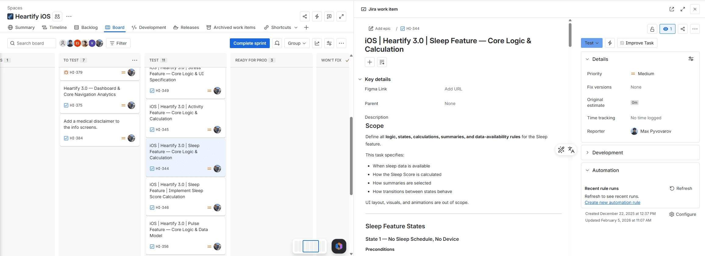
Most of my work on Heartify went beyond visual design. I developed the scoring logic for each health metric — defining formulas, edge cases, data availability rules, and output contracts. These specs were handed directly to developers as the source of truth.
View Full Spec →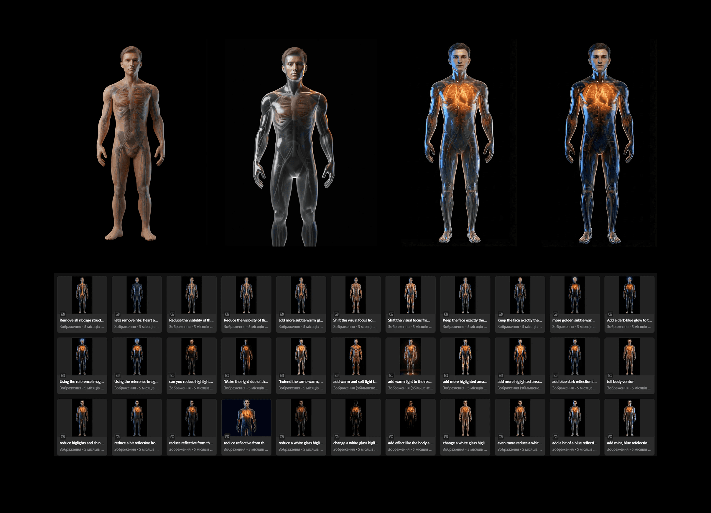
The anatomical character was modeled, rigged, and animated from scratch. Each health state — rest, stress, elevated heart rate — has a unique animation loop tied to real-time data.