Heartics — Pulse & HRV Analyzer
Designing a camera-based heart rate monitor with AI-powered analysis and medical-grade data visualization.
Heartics is a heart-health app with a freemium model: free pulse and HRV measurement, with results that unlock fully for one day before locking. The AI Health Assistant — which explains what the reading means — is a paid feature. I designed the full product from scratch: measurement UX, paywall logic, Poincaré plot visualization, AI assistant interaction, and developer handoff. Designed but not shipped — so the numbers below are what it was built to move, not results.
Most consumer heart-health apps either lock everything behind a paywall (kills trust before users see value) or give it all away free (no path to revenue). The product needed a third option: let users feel the value first, then ask them to pay before that value compounds.
Design a measurement-and-paywall flow where users complete their first reading, get a real result they can trust, and meet the paywall exactly when their next reading would matter most — the next day. Two metrics drove the design:
Activation
Complete first measurement30–60 seconds of holding the phone steady is the hardest moment. The camera UX, signal-quality indicator, and result reveal are designed to get users from launch to first valid reading without drop-off.
Subscription conversion
Free → paid at day 2Free users see their day-1 result clearly; on day 2, the feed reveals blurred result cards — they remember the value and hit the paywall when motivation is highest. The AI Health Assistant sits as the unlock incentive.
- 01Researched clinical HRV visualization standards and adapted them for mobile.
- 02Designed the camera measurement UX to minimize drop-off during 30–60 second readings.
- 03Built the AI assistant interaction model and response format.
- 04Delivered full developer handoff with interaction specs and component documentation.
Designed but not shipped — no claimed results. What the work was built to move and how I'd prove it:
Activation
D1 completion 70%+% of new users who complete a full 30–60s measurement and view their first result. Plus 7-day return rate — users who came back voluntarily.
If completion drops below 60%, the camera UX is too demanding and needs simplification before any paywall optimization matters.
Subscription
Trial-to-paid conversionDay-2 paywall view rate (do users return at all) and trial-start rate from the blurred feed. A/B test the AI Assistant prominence — is it the unlock driver, or is unlimited measurement?
Refund rate +1pp max, 30-day churn +2pp max. If users feel tricked by the blur reveal, the model is broken even if conversion looks good.
Measuring
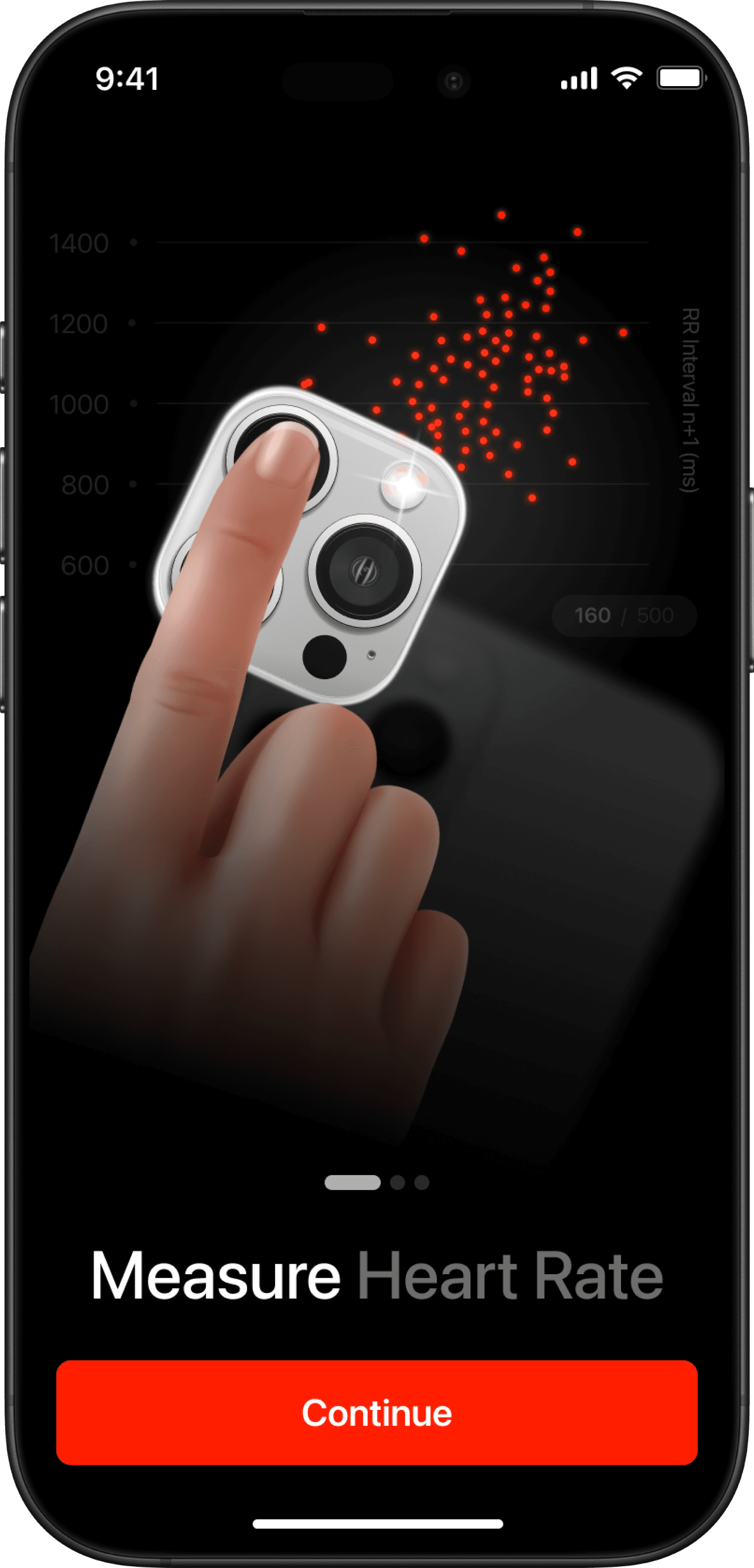
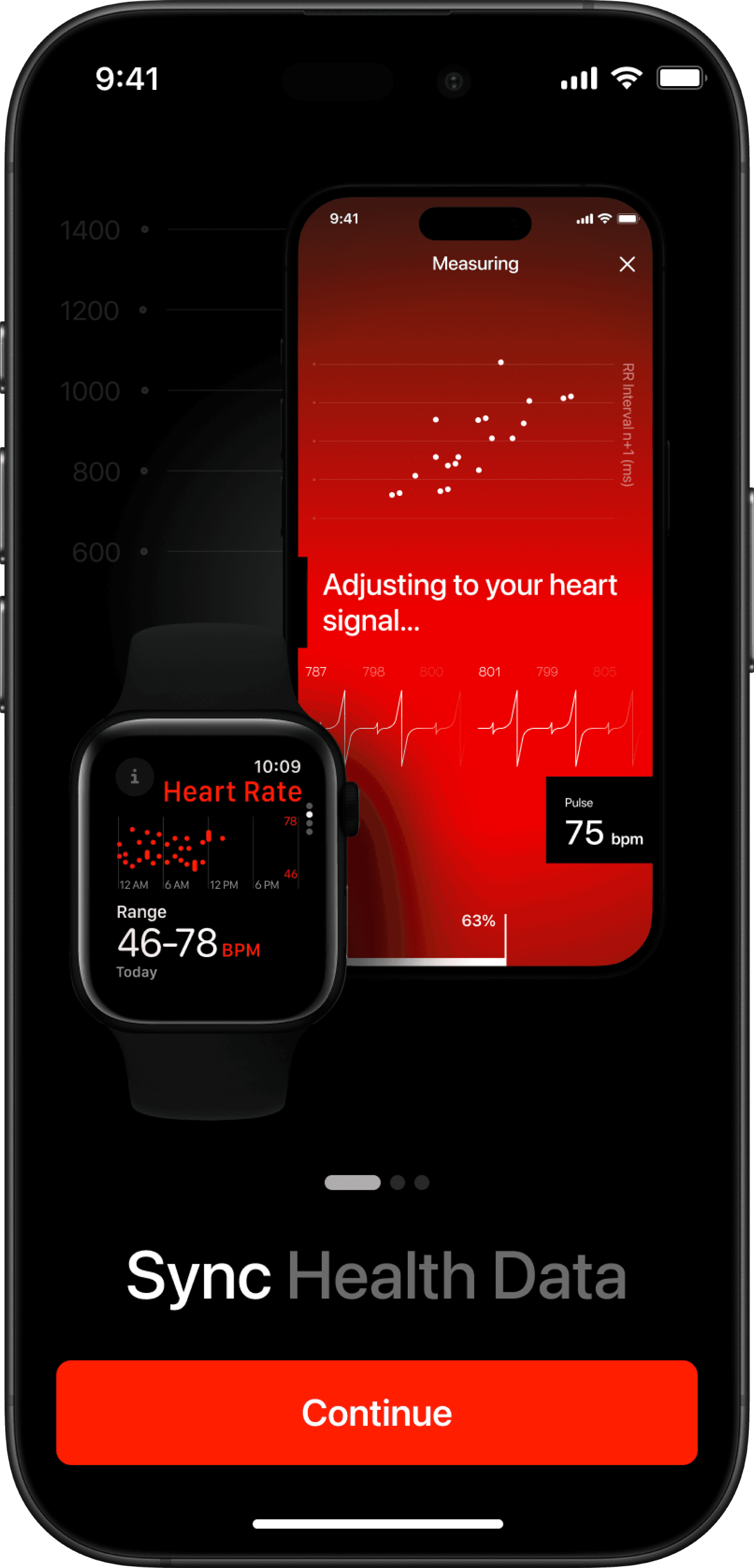
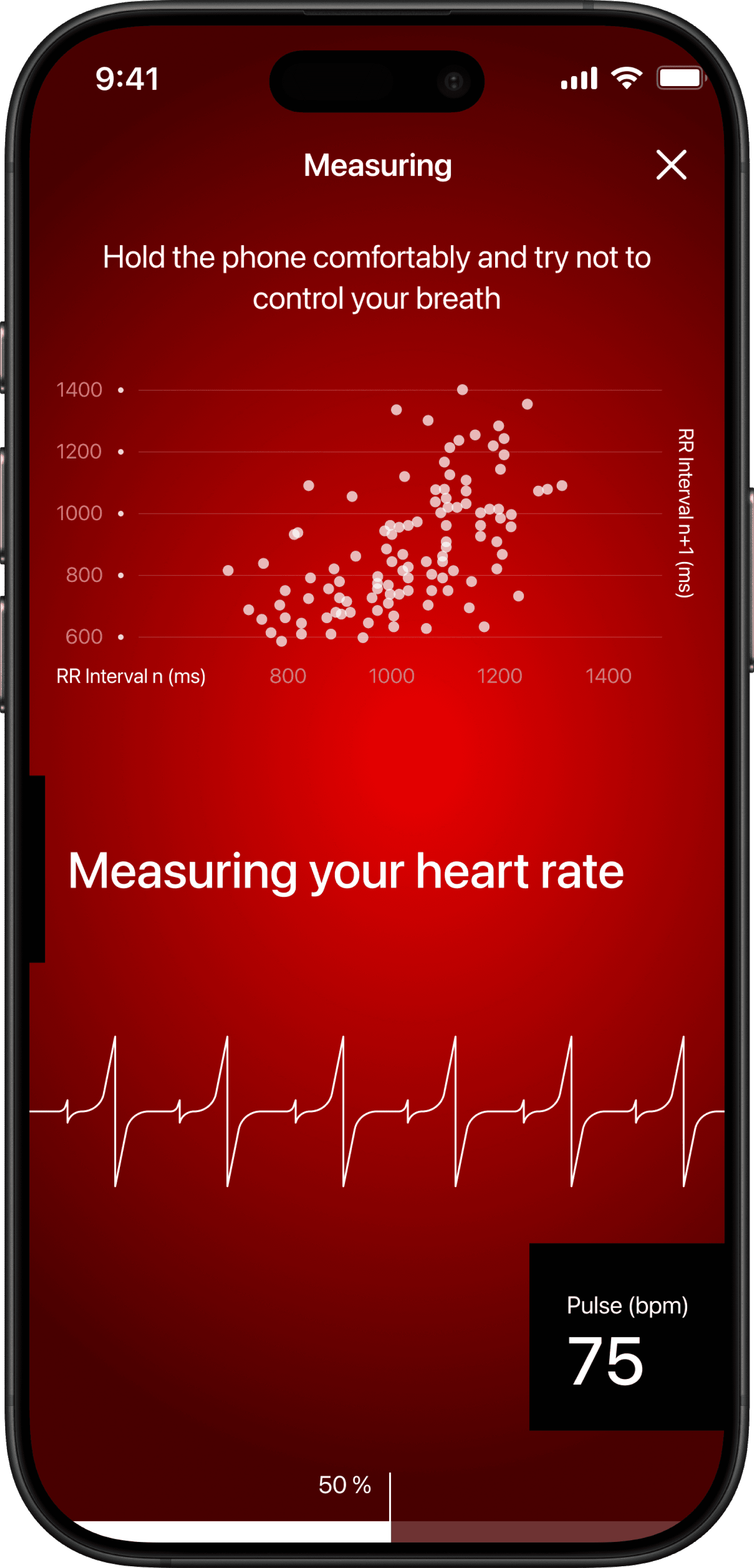
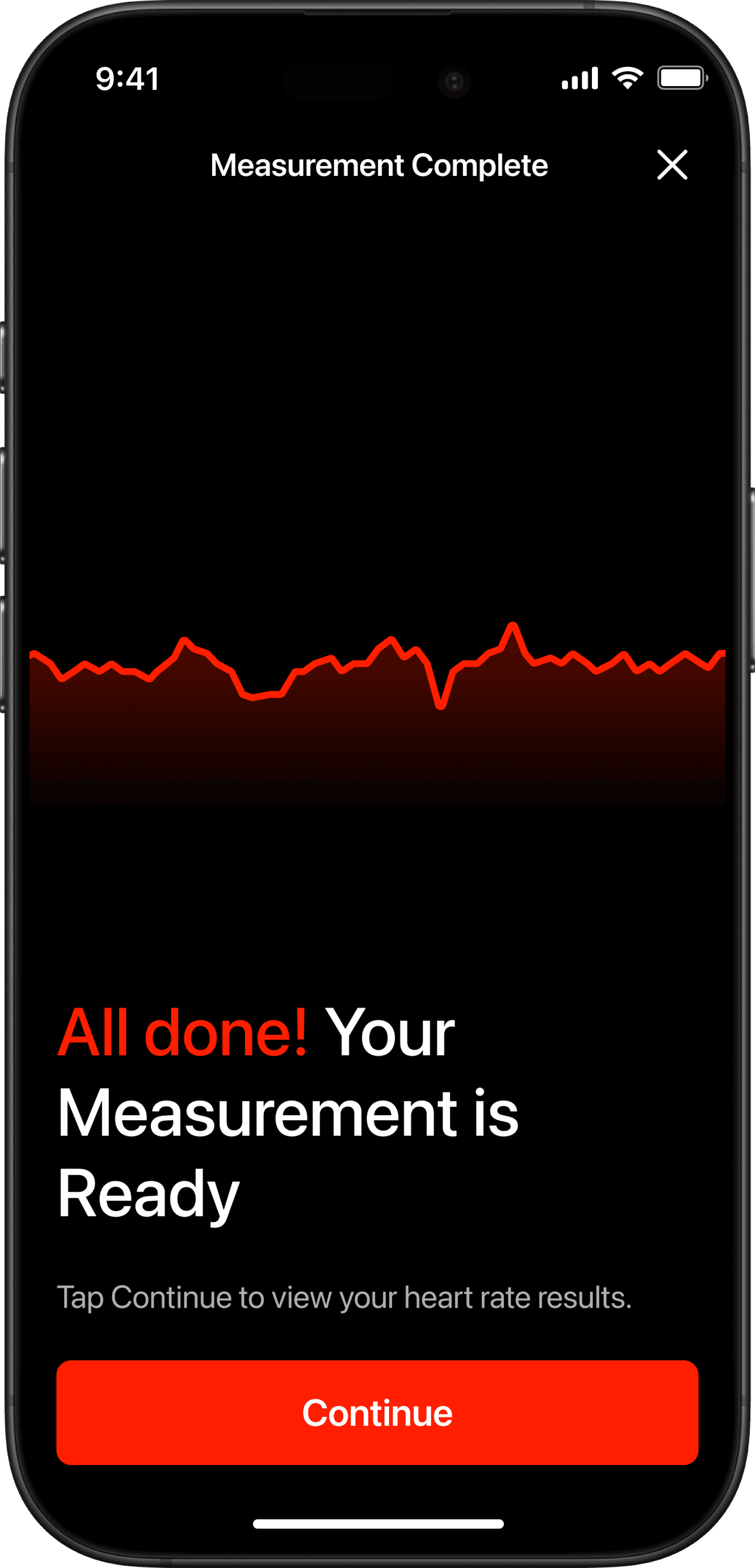
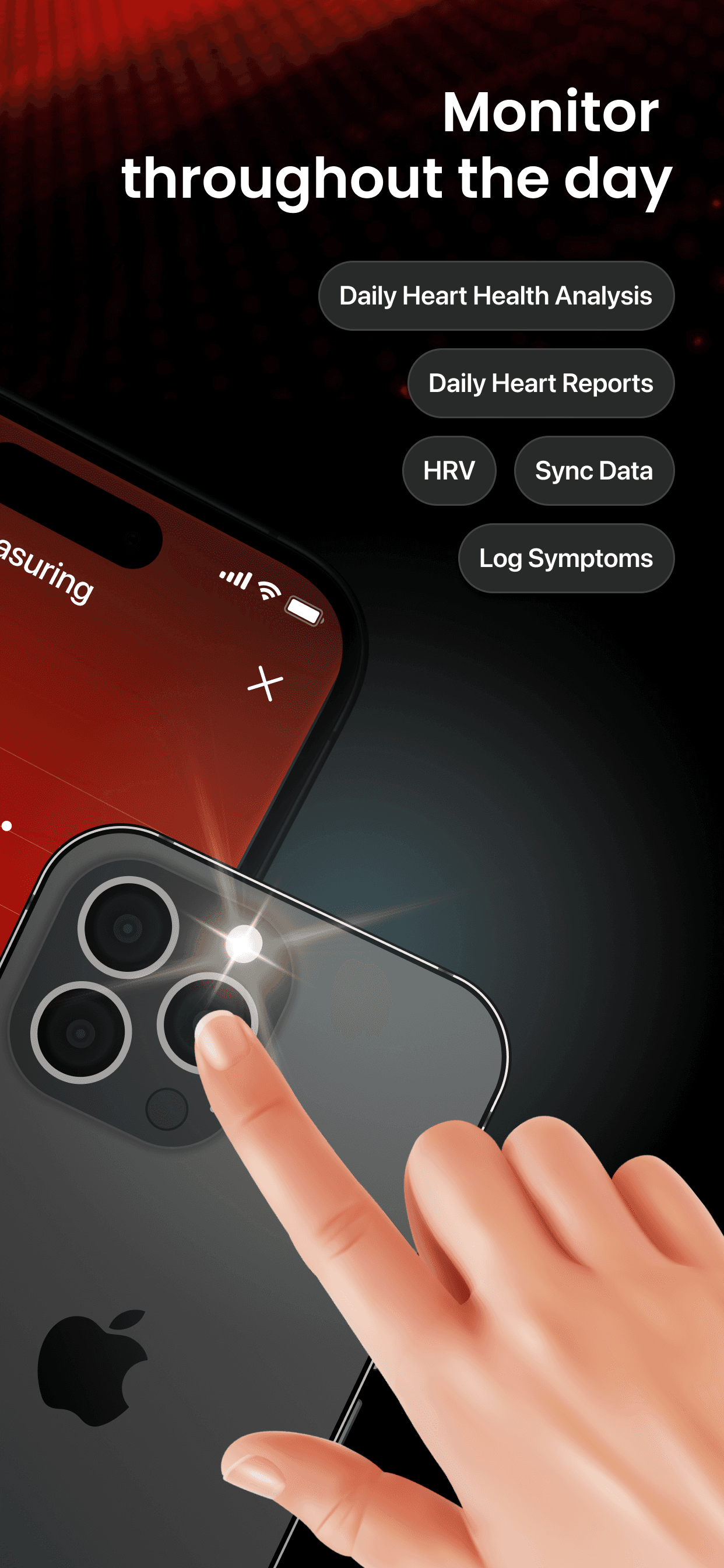
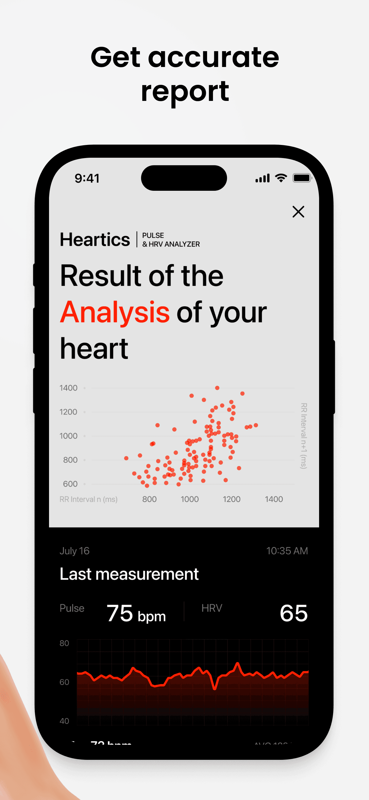
The app uses your phone's camera to measure heart rate through subtle changes in blood flow — photoplethysmography. Users see a live Poincaré plot, a real-time heart rate graph, and gentle on-screen guidance.

Result
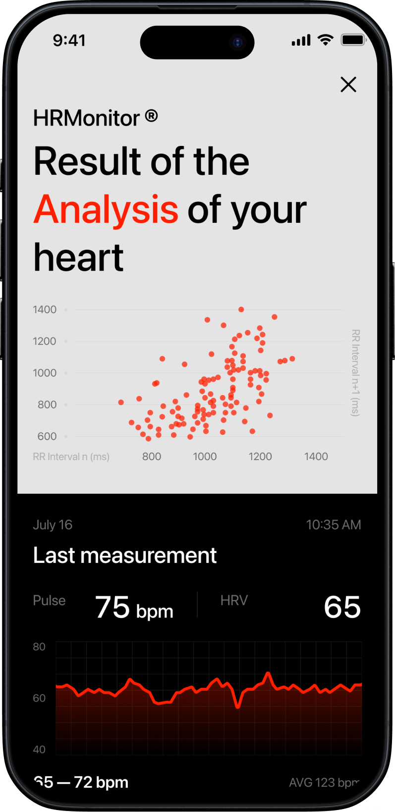
After the measurement, users see their heart rate and HRV results alongside insights from the AI Health Assistant. The assistant highlights changes, trends, and provides an easy-to-understand overview of heart health.
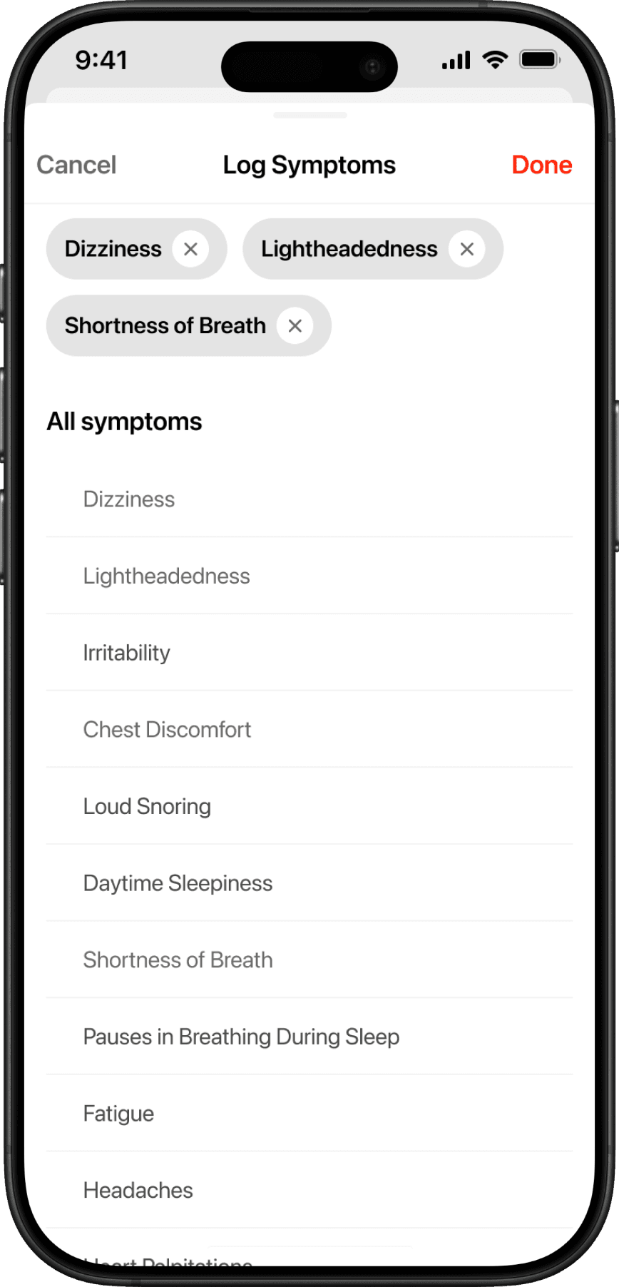
Users can log their symptoms to add extra context to each measurement, helping the app provide more accurate insights and a deeper understanding of their overall condition.
Dashboard
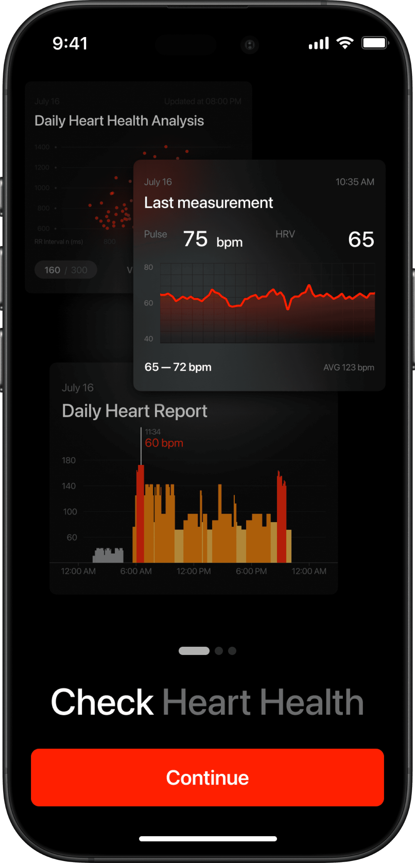
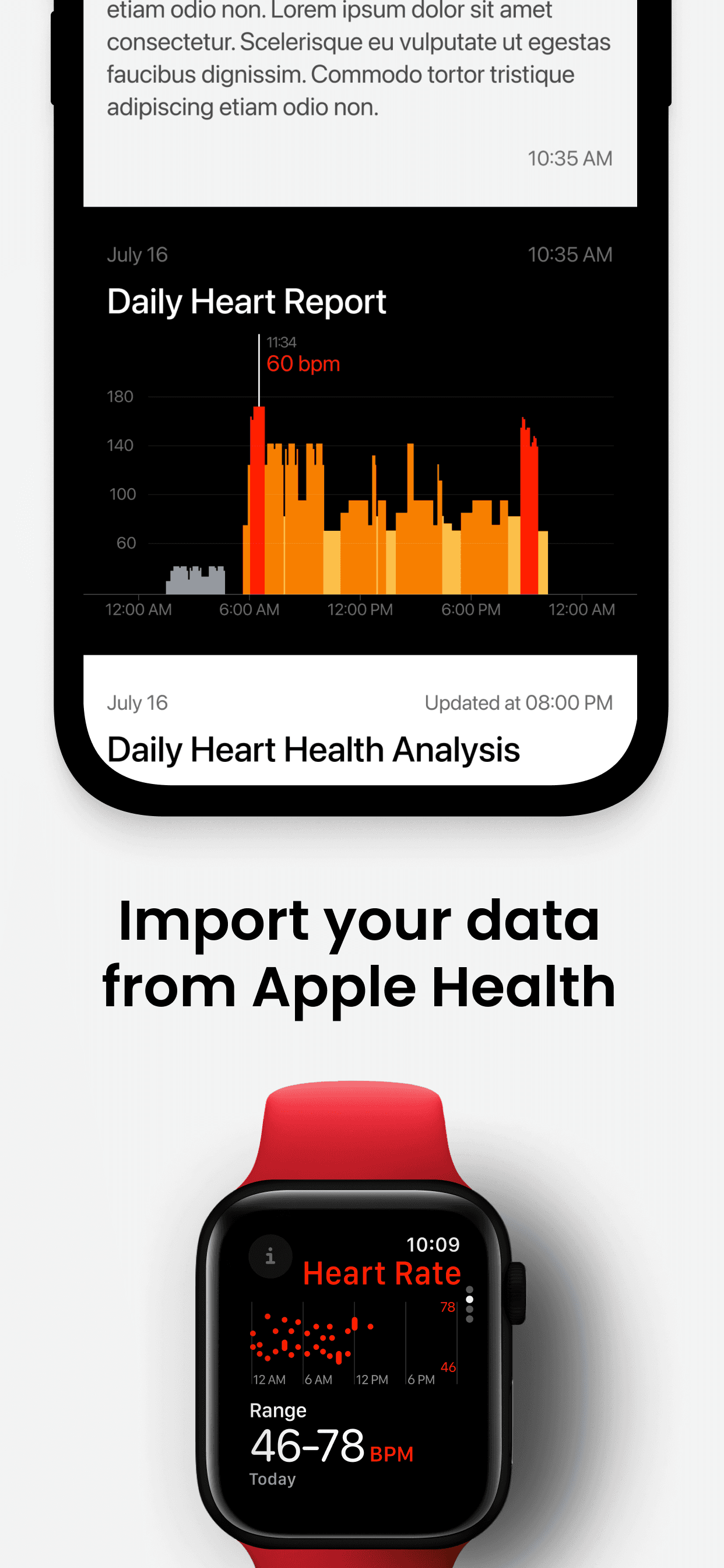
The dashboard gives users a clear overview of their heart health history, recent measurements, and trends — making it easy to track changes over time and understand their overall condition at a glance.
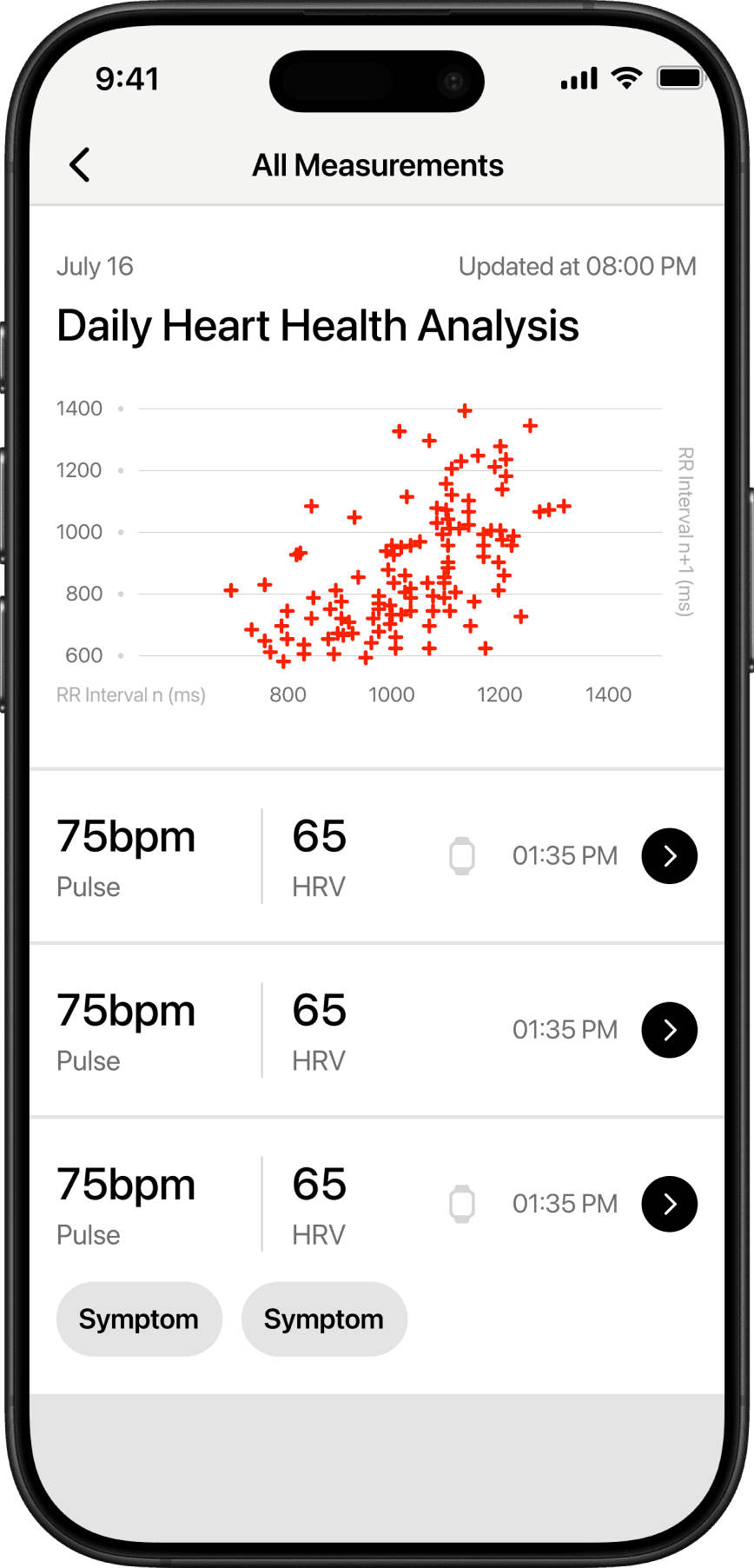
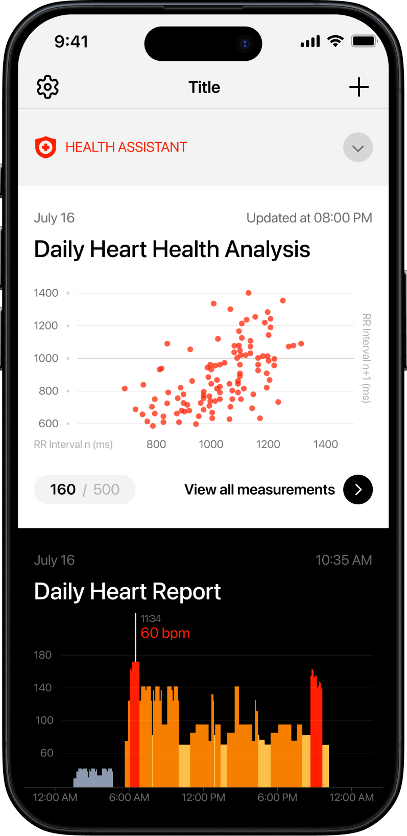
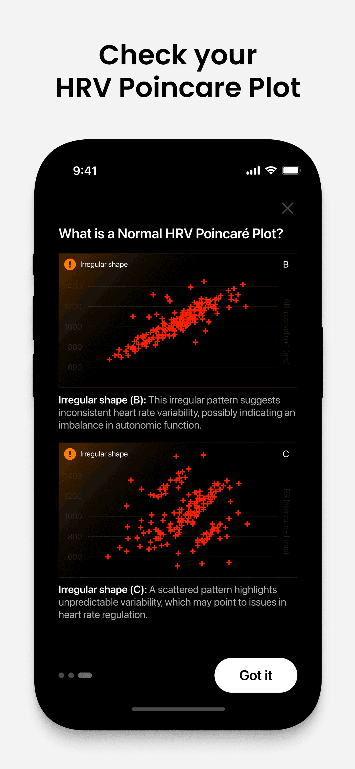
Reading the Pattern of Your Heart
Explore how your Poincaré plot visualizes the natural rhythm of your heart. By learning what smooth or scattered shapes mean, you can better track your heart's variability and daily wellbeing.


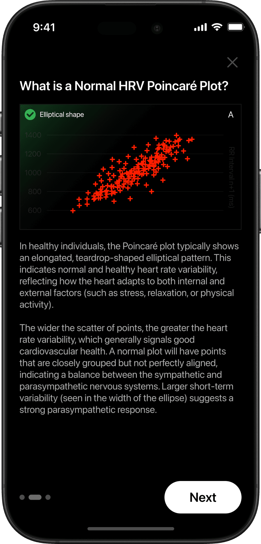
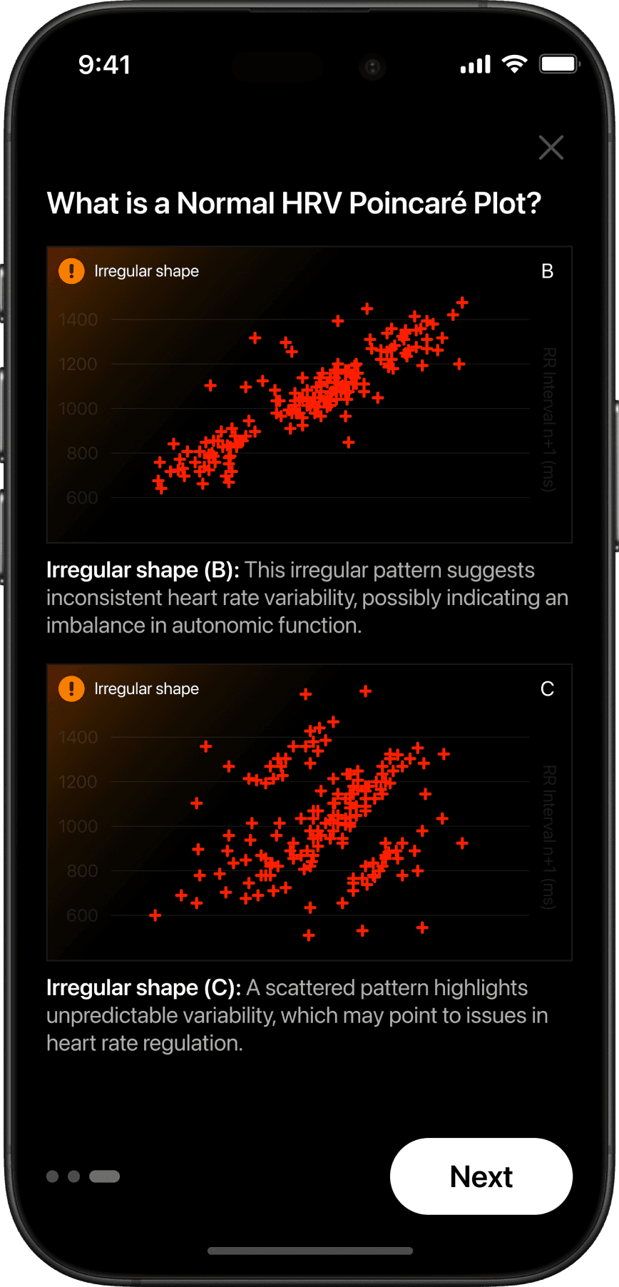



All tasks, user stories, and sprints were tracked in Jira — from initial research through design handoff. Each screen had its own ticket with acceptance criteria and linked Figma frames.
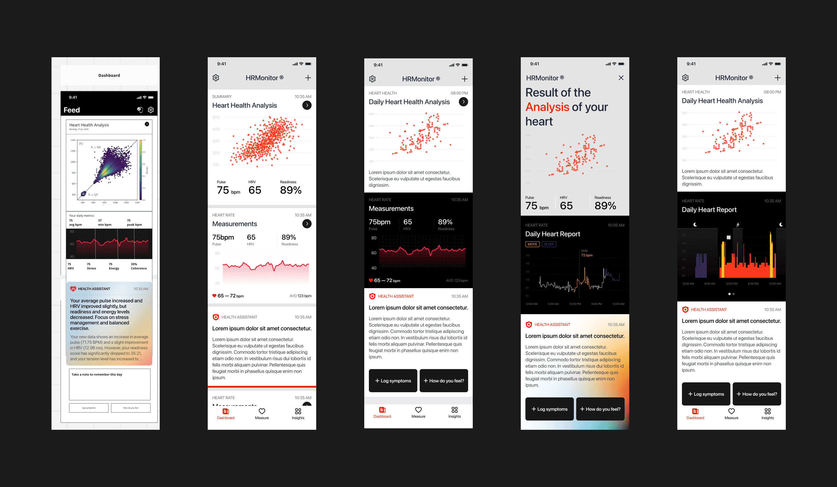
Here I show the process of creating the dashboard and result screen — including layout iterations, data hierarchy decisions, and multiple variations of the heart report graphs. Each variation was tested for readability and visual clarity before the final direction was chosen.