AntiqFind — Antique Discovery App
Cross-platform mobile app for discovering, valuing, and collecting antiques — live on the App Store.
AntiqFind is an antique identifier and appraisal app. I designed and shipped the iOS app, then built two web acquisition funnels in Next.js + TypeScript + Tailwind to drive installs — production-ready code in two days, deployed live to GitHub Pages. This is the case study where I work as a solo shipper: design, code, deploy. AI-assisted prototyping does the heavy lifting, but the product decisions and the funnel mechanic are mine.
Antique identification is a slow, intimidating category — people have an object, don't know what it's worth, and turn to expert appraisers or Google. The app needed an acquisition funnel that captured that exact moment: someone curious enough to type 'what's this worth' but not yet ready to install. Generic landing pages don't convert that intent — they explain too much, ask too early.
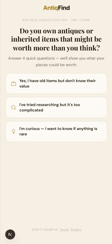
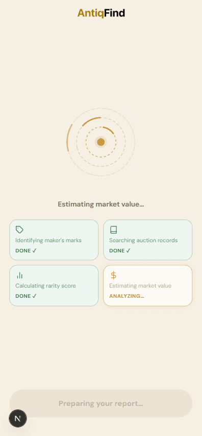
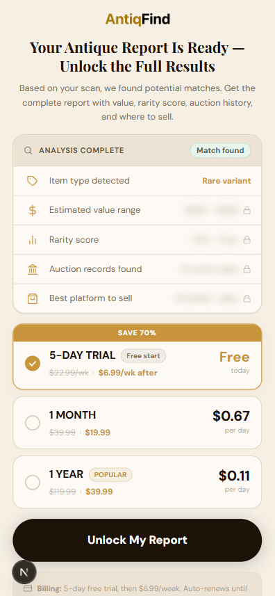
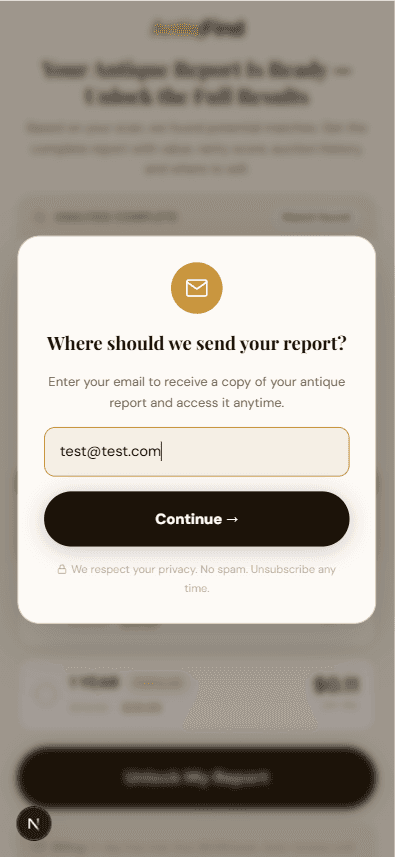
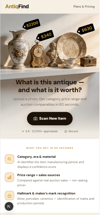
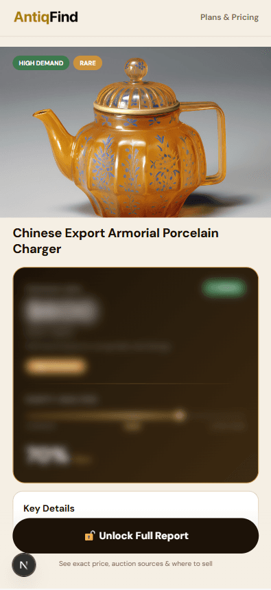
Design two web funnels that turn curiosity into installs, using a single conversion lever: the blurred report. Visitors upload a photo, see a generated valuation report — but the price range, sources, and details are blurred behind a fixed CTA. They see exactly what they'd get, and exactly what they're missing. The unblur happens inside the app, after install. Two metrics drove the design:
Funnel conversion
Visitor → install% of visitors who upload a photo, see the blurred report, and tap through to App Store. The blur calibration is the key lever — too much blur and curiosity dies, too little and there's no reason to install.
A/B variant performance
Which funnel winsTwo funnels with different value framings — same blur mechanic, different headlines, photos, and CTAs. Tracking install rate per variant to learn what message hooks the antique-curious user.
- 01Designed full UX flow for iOS and Android from scratch.
- 02Built UI system consistent across both platforms.
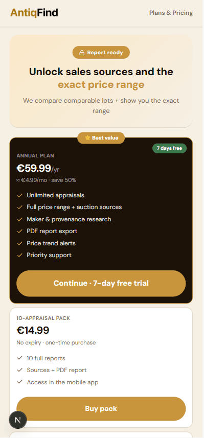
- 03Designed web marketing funnel with blurred report and fixed CTA as core conversion mechanic.
- 04Delivered complete handoff for development.
Funnels shipped live to GitHub Pages, both instrumented end-to-end. The design was set up to A/B test two value framings against the same blur mechanic — what's measured and how I'd have read the data:
Funnel conversion
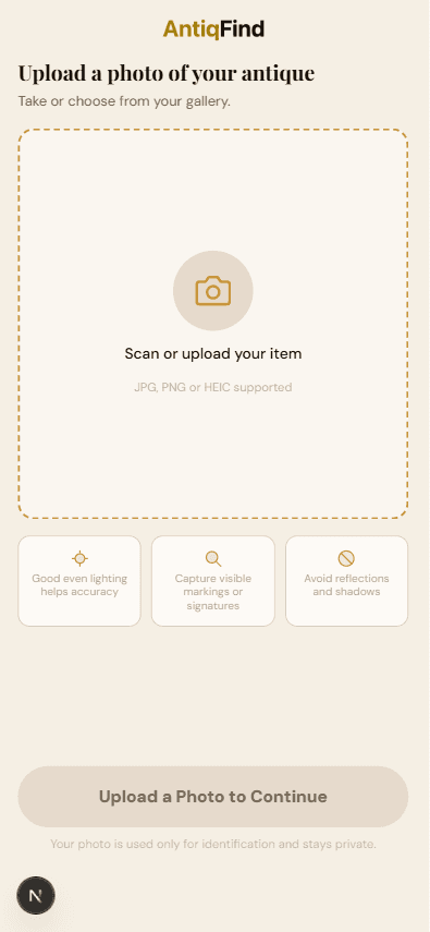
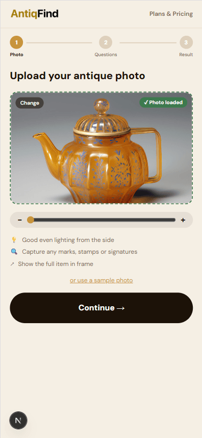
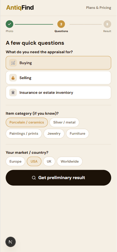
Visit-to-install trackingBoth funnels instrumented end-to-end: landing → photo upload → blurred report view → CTA tap → App Store redirect. The funnel was designed to expose drop-off at each step, so the team could see whether the loss is on the funnel side or the App Store side.
If photo-upload rate dropped below 30% of landings, the funnel was asking for commitment too early — the value prop needed to land before the upload, not after.
A/B variant performance
Statistical confidence pendingVariant A vs. Variant B with shared blur mechanic but different headlines, photos, and CTAs. Required ~500 visitors per variant before a winner could be called with 95% confidence — the threshold was baked into the analytics setup.
If both variants converged under 2% install rate, the blur mechanic itself wasn't enough — needed pairing with a stronger first-impression hook (e.g., live valuation examples above the fold).
App Overview — Discover, Value & Collect
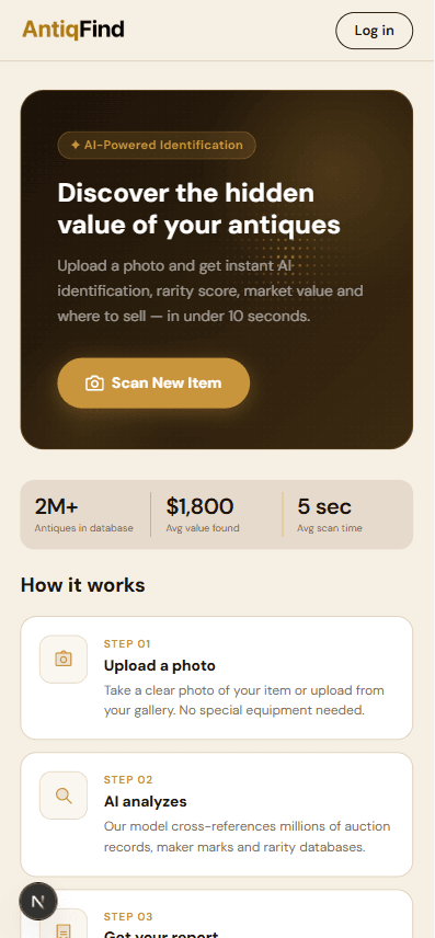
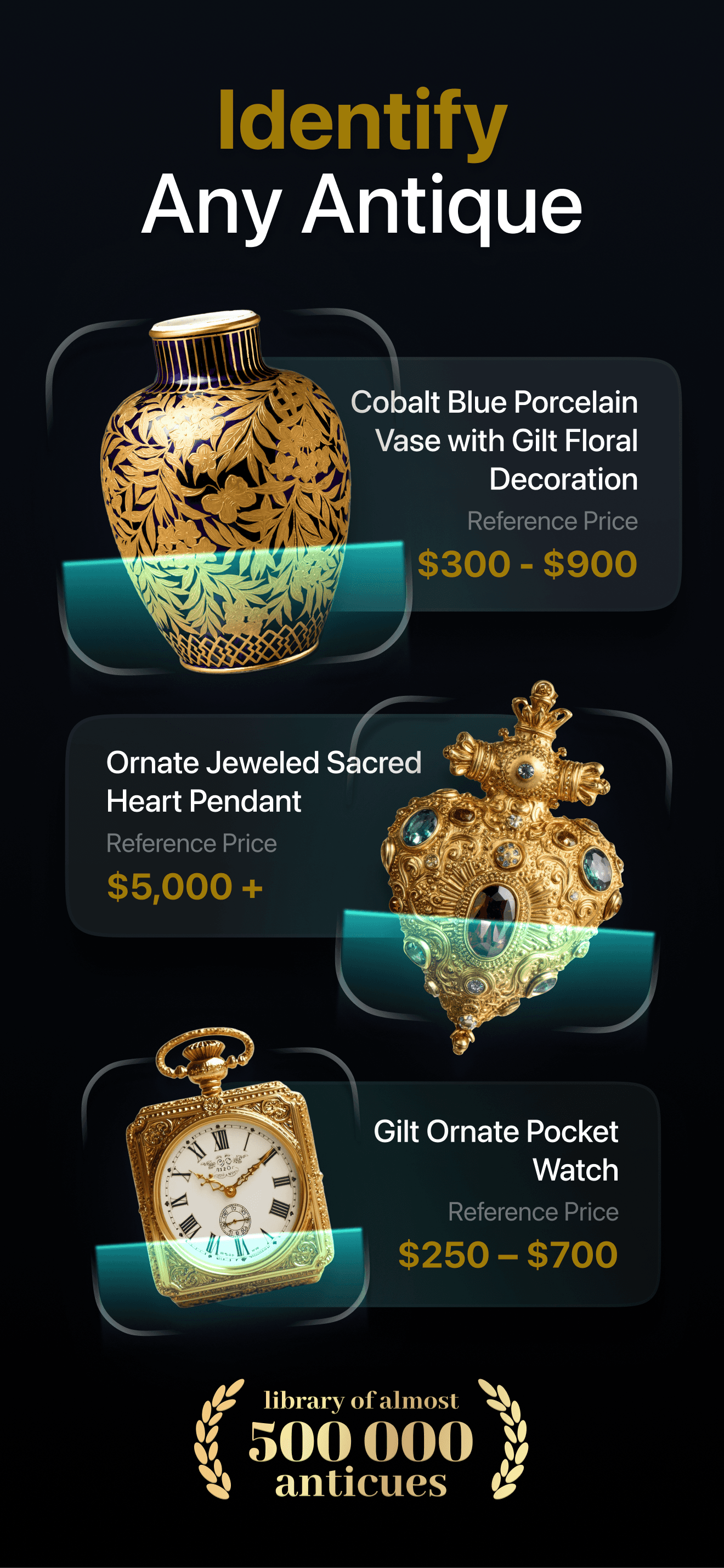
AntiqFind makes it easy to identify antiques, track their market value, and build a personal collection — all from your phone. The app works on both iOS and Android, with a consistent experience across platforms.

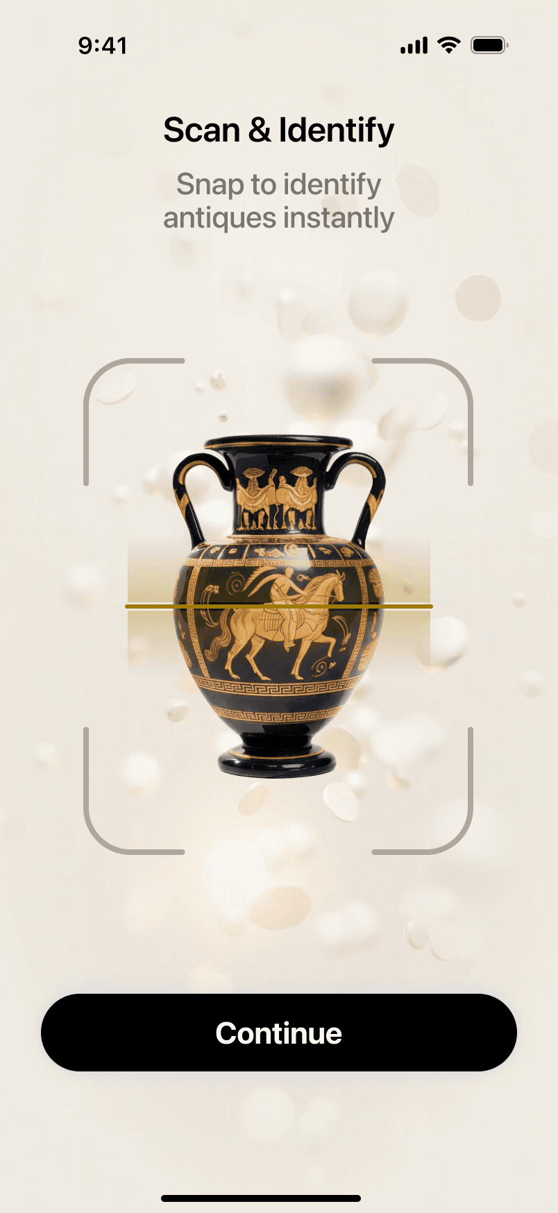
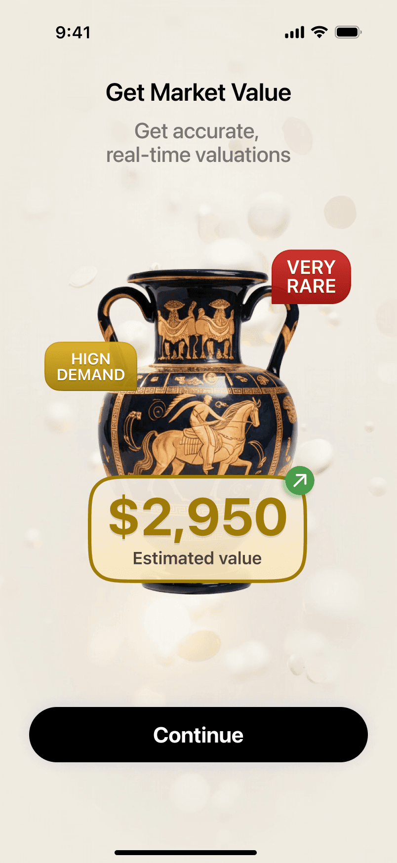

Core Screens — iOS & Android
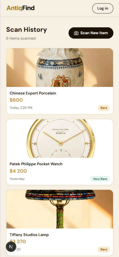
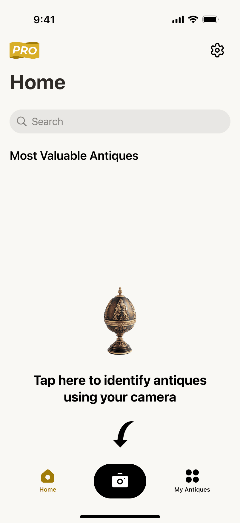
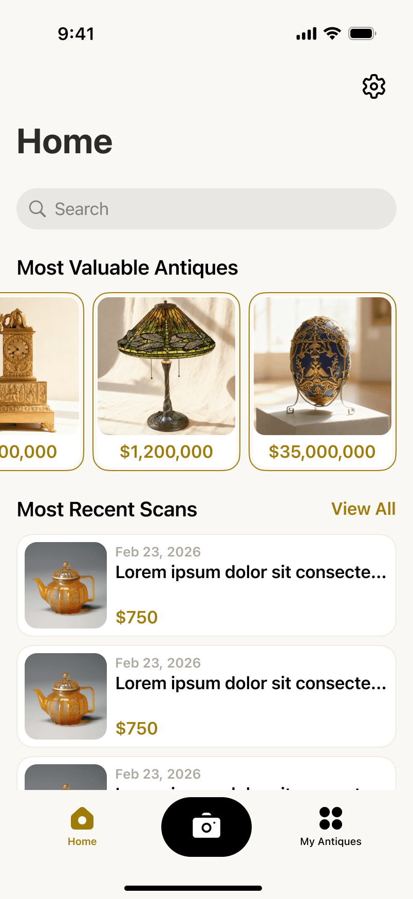
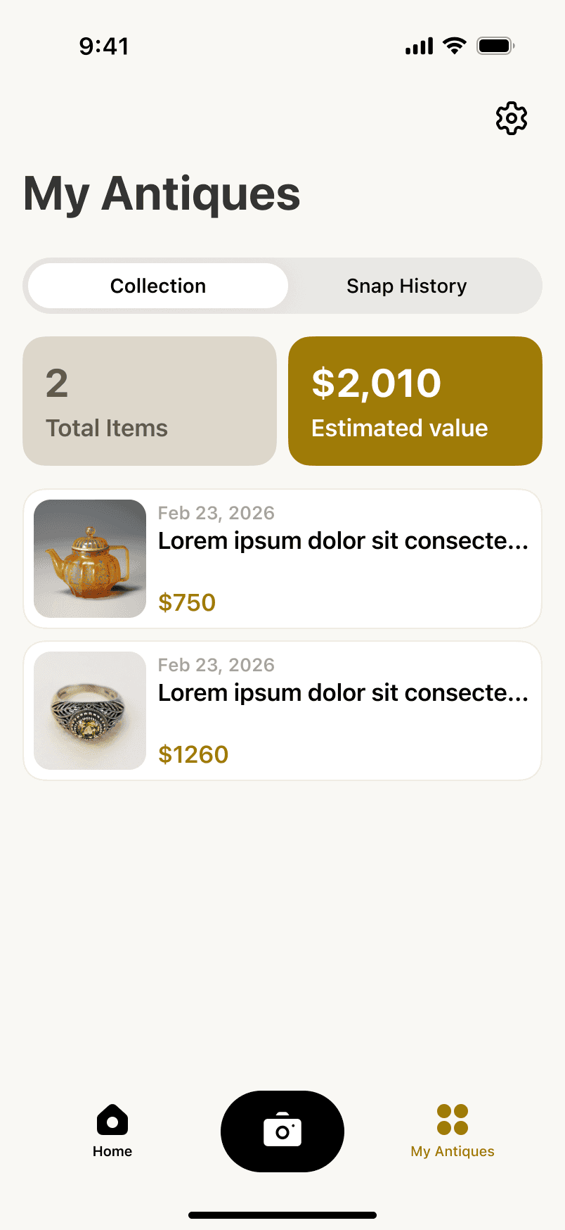
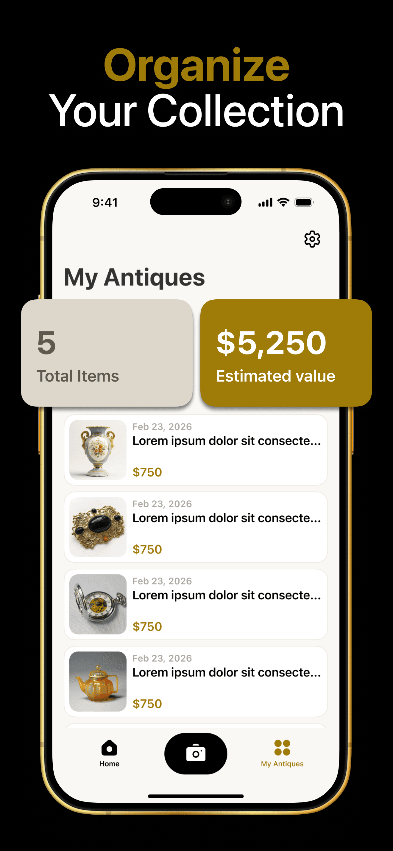
Key screens from the main app flow — home feed, item detail, market value view, and collection management. Each screen was designed to feel native to its platform while maintaining a shared visual language.







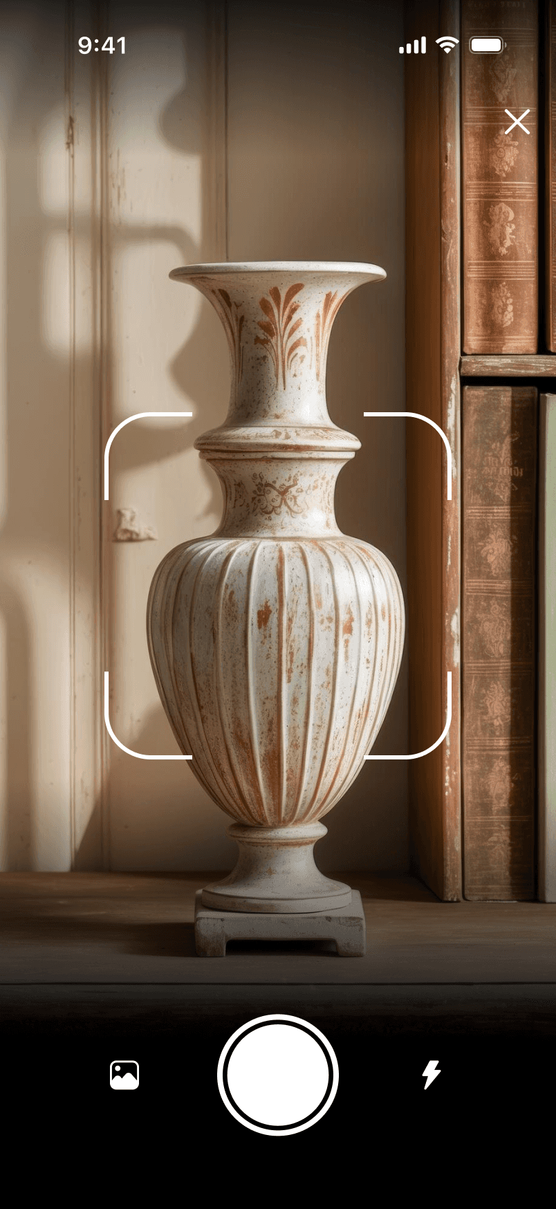
Camera, Scan Tips & Loader
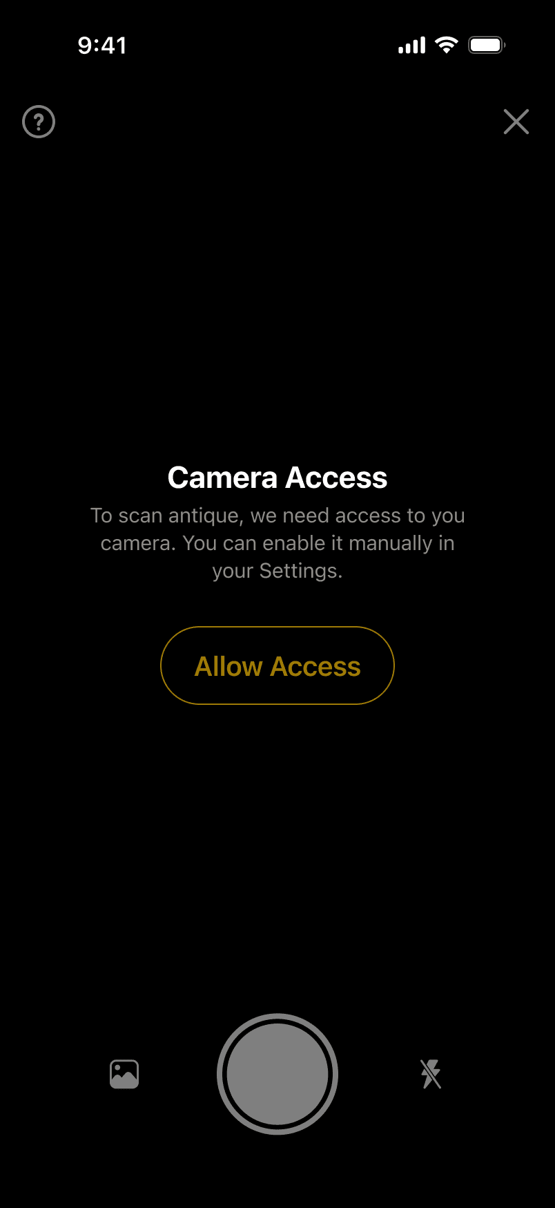
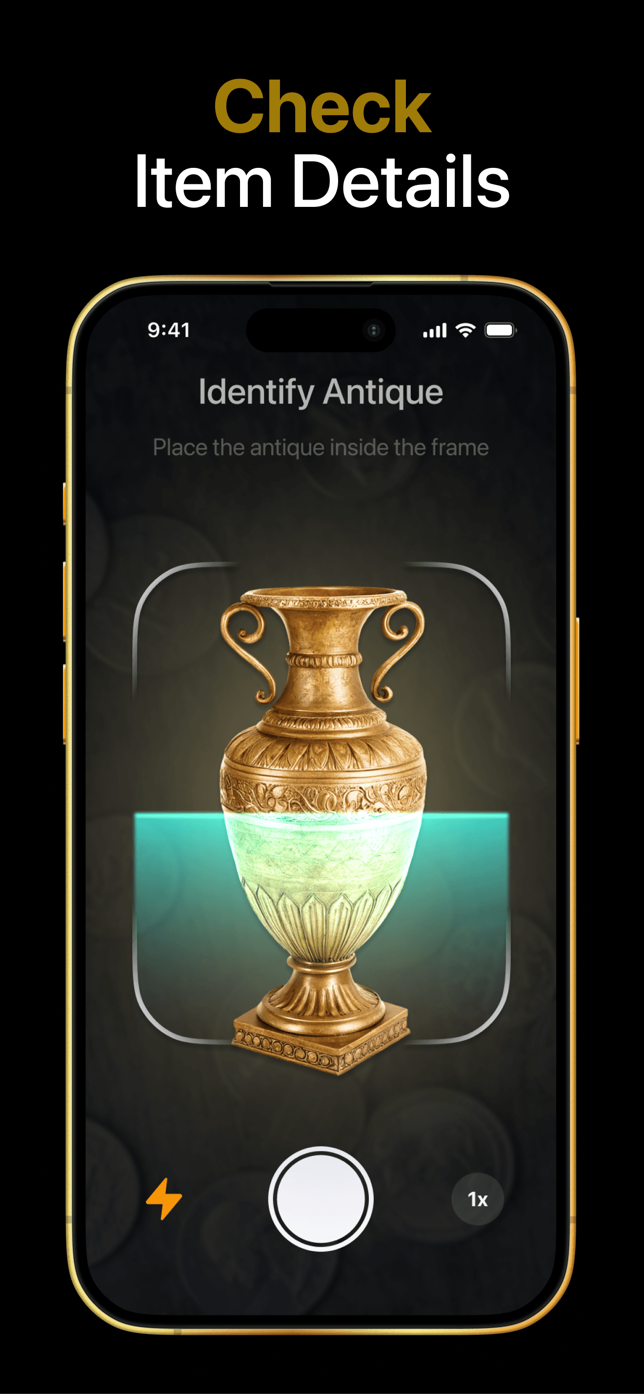
Camera access screen, snap tips with visual guidance for users, and the scanning progress loader — the full flow from permission request to active scanning.

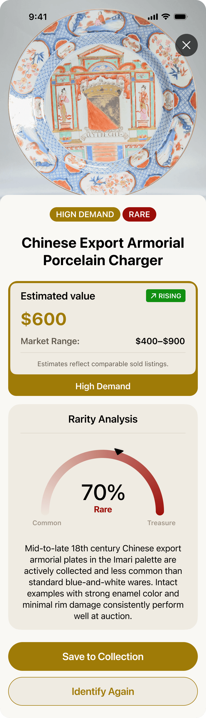
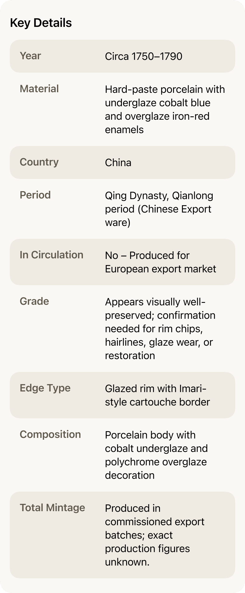
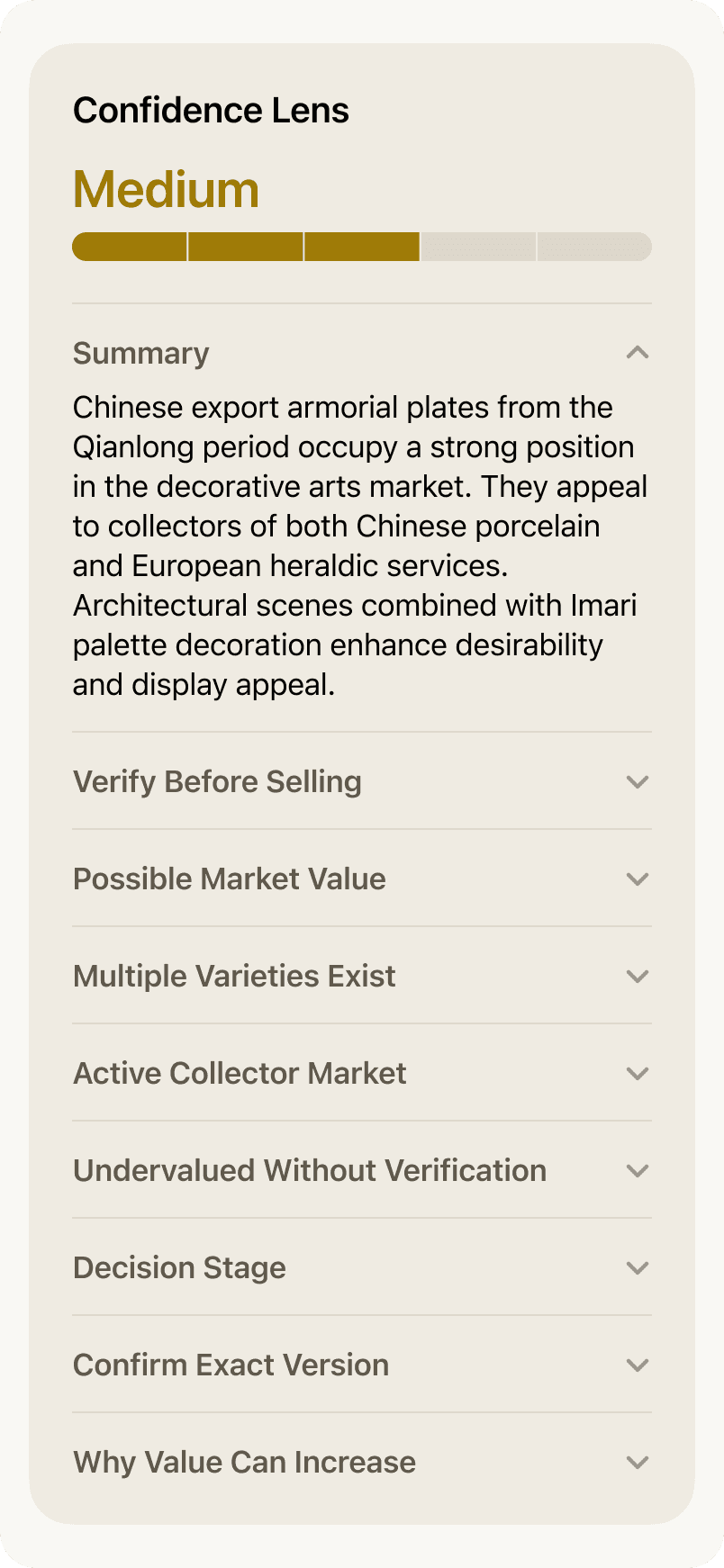
Result Screen
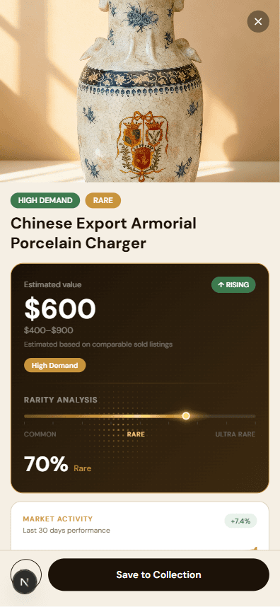
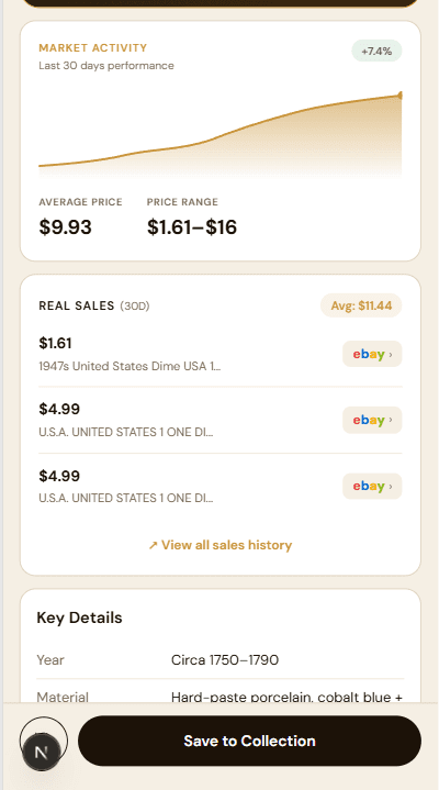
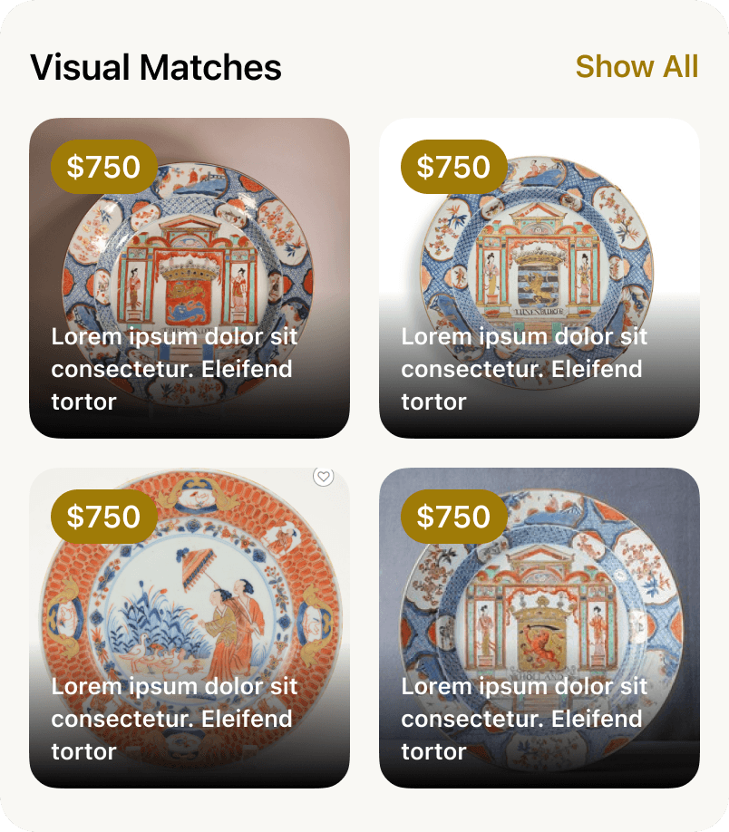
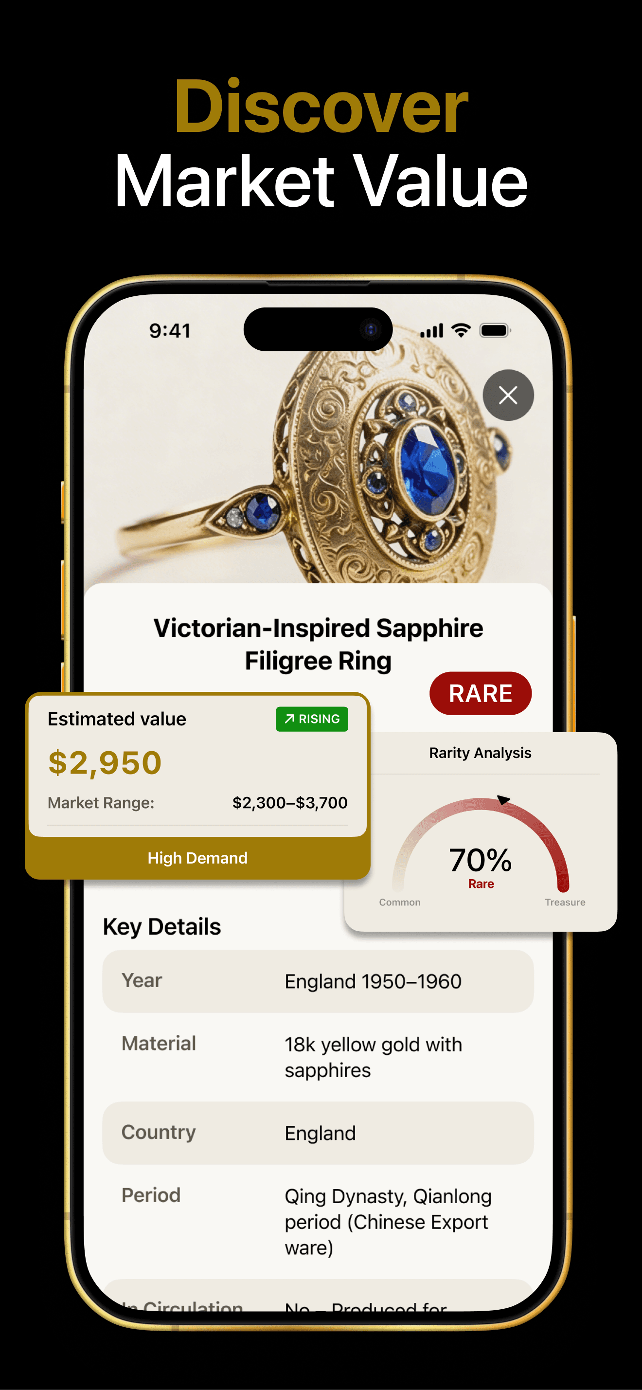
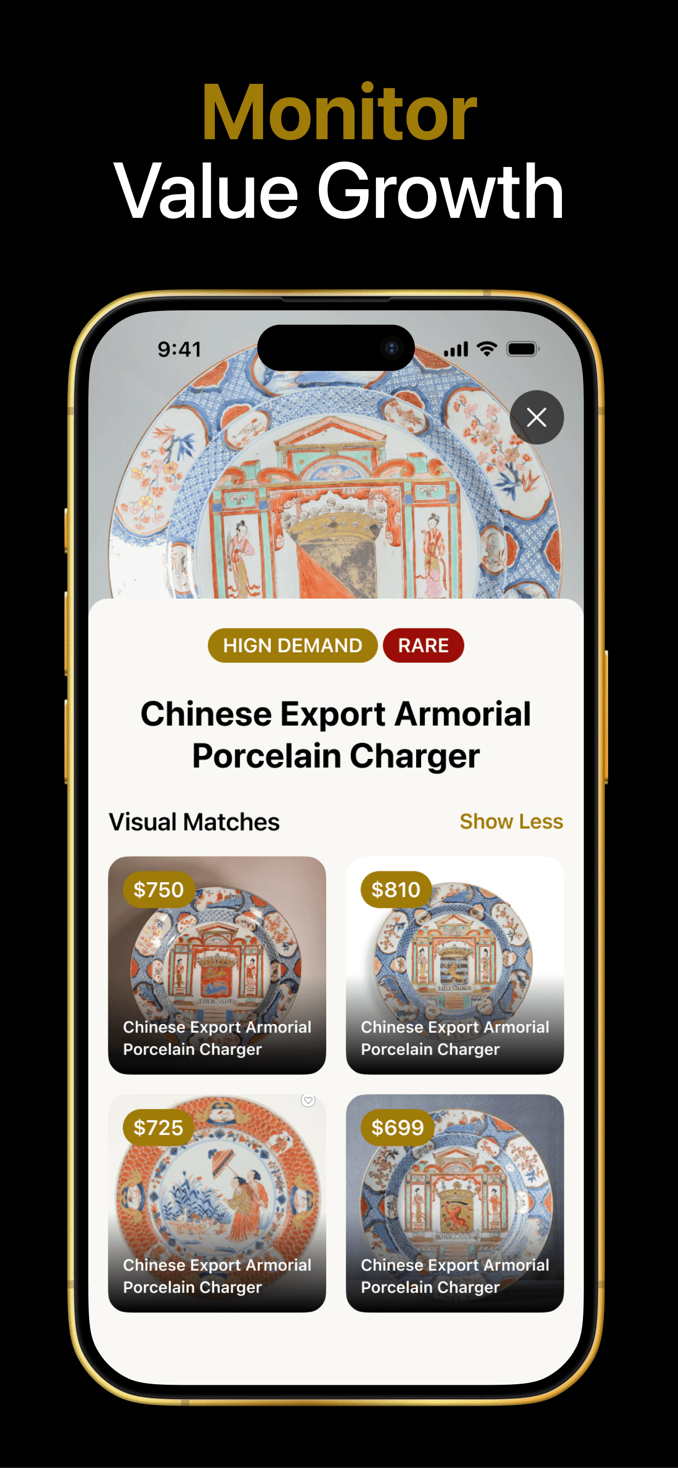
The result screen shows the identified antique with its estimated market value, rarity analysis, key details, AI-generated confidence lens, and visual matches — giving users a complete picture of what they've found.
Web Funnel — Next.js + TypeScript + Tailwind
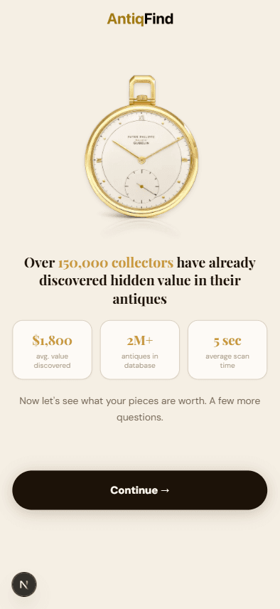
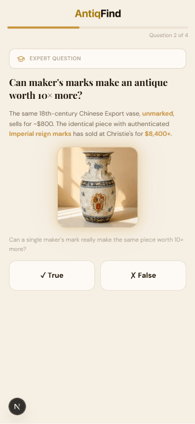
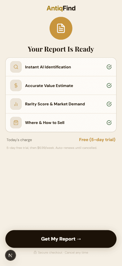
To support app growth, I designed and built two conversion-focused marketing funnels alongside the mobile product. The core mechanic: a blurred antique valuation report with a fixed CTA — creating curiosity and driving installs. Both funnels were assembled in Cowork and shipped to GitHub in 2 days, ready for the developer to deploy and A/B test immediately.